
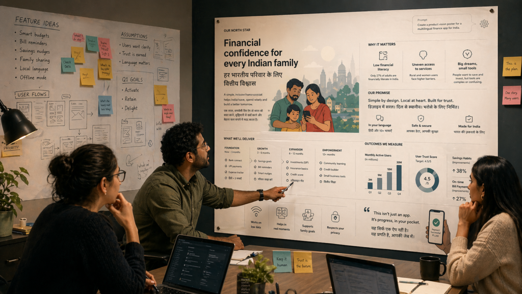
Somewhere between a grain of rice and a 2K poster, OpenAI quietly redrew the boundaries of what image generation is allowed to claim. It’s no longer content with “pretty pictures”; it wants to be your layout engine, your language department, your research assistant, and your visual operating system for work.youtube+2
ChatGPT Images 2.0 is not just another model bump. It’s a bid to turn image generation into infrastructure – and that has very immediate consequences for designers, marketers, and product teams who thought they were still dealing with a toy.linkedin+1youtube
The moment the poster stopped being a toy
Watch the launch reel again, but this time pretend you’re a mid‑level designer in Bengaluru, a marketing manager in Gurgaon, or a PM trying to get a feature shipped before the next quarter’s OKR review. You’re not looking for spectacle. You’re looking for: “Can I ship this?”youtube+1
OpenAI’s answer is unambiguous. ChatGPT Images 2.0, they tell you, can:
- Generate “complex, polished, and production‑ready visuals … with accurate text and structured design”.¹youtube
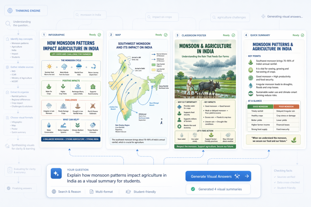
- “Think” and “research”, “search the web” and generate infographics that “solve math problems with proofs”.¹youtube
- Output 2K images across multiple aspect ratios with “extraordinary micro details”.¹youtube
- Render dense paragraphs of text in Chinese, Korean, Japanese, Bengali and, in their words, “every single language” correctly.²youtube
This isn’t the usual AI‑demo choreography of “look at this surreal cat in a spacesuit”. It’s a vision board for replacing a large chunk of everyday visual work: pitch decks, educational posters, campaign assets, internal reports.youtube+2
By paragraph four of the product narrative, OpenAI’s thesis is clear:
Images are not just decorative outputs; they are answers, and ChatGPT should be the system that composes them.¹techradaryoutube
The more interesting question is what that claim does to the people who currently answer through Figma, PowerPoint, or Illustrator.
From spectacle to infrastructure
The core video leans heavily on analogy. DALL‑E was cave art. Imagen 1 was “ancient art”. Images 2.0 is presented, with no shortage of confidence, as a kind of Renaissance.¹ Hyperbole aside, there is a genuine structural shift here.youtube
Earlier image models were essentially novelty engines. You prompted for a moodboard, a book cover concept, or a fantastical landscape, and you got something aesthetic but brittle: text warped, layout collapsed, character continuity fell apart across frames.youtubetechradar
Images 2.0, in contrast, is explicitly framed as an engine for systems rather than single shots:
- “Entire magazines with structured typography and photorealistic photos.”¹linkedinyoutube
- “Full renovation plans for every room in your house.”¹youtube
- “Manga comics with recurring characters and evolving storylines.”¹youtubeyoutube
That’s not a moodboard. That is the terrain on which agencies, studios, and in‑house design teams actually earn their retainers.
Tech press reporting has picked up the same note. TechRadar describes the shift as moving from “quick interpretation to something closer to deliberate construction”, emphasising a new reasoning phase where the model “break[s] a request into parts” and plans the image before rendering.³ This is not just “make it pretty”. It is “compose it like a document”.techradar
For practitioners, the implication is uncomfortable but unavoidable:
- If your value is primarily in execution – placing text, balancing layouts, finessing posters – you now have a machine that does a plausible first pass for free.youtubetechradaryoutube
- If your value is in deciding what should exist – narrative, brand position, strategic framing – your job just became simultaneously more important and harder to hide behind production effort.
The model has moved into your lane. The only safety left is upstream.
Aspect ratios and the quiet automation of design judgement
One of the more revealing videos is the aspect ratio and resolution demo. On the surface, it’s a technical walkthrough:sharpe
- The previous system capped resolution around 1K; the new one supports 2K images through the API.youtube+1
- It can handle arbitrary aspect ratios, including ultra‑wide (3:1 posters, panoramic 2:1 scenes) rather than just square or fixed presets.sharpe+1
- It preserves micro‑details – down to a single grain of rice – even when you zoom into the output.youtube
Useful, but not exactly existential – unless you watch how the model chooses its own aspect ratios based purely on the semantics of the prompt. Ask for a 360‑degree ocean panorama, and it sensibly picks a wide ratio without you specifying it. Ask for a poster, and it composes with negative space that would have taken a junior designer a few iterations to get right.youtubeyoutube
What’s being automated here is not just pixel density. It is layout judgement:
- Deciding when to stretch, when to compress, where to leave breathing room.
- Aligning aspect ratio with content intent without the user ever twiddling a knob.
This matters because aspect ratio is where a lot of messy organisational politics used to hide. The endless back‑and‑forth of “make the logo bigger”, “fit this extra line of copy”, “add one more graph” played out in Figma comments and half‑resentful Slack threads. Now, those same stakeholders may be looking at a model‑generated layout that simply feels right from the outset.youtubeyoutube
If you’re a designer, this doesn’t make you redundant. It does, however, change the first draft from “blank canvas” to “machine’s proposal”, and that subtly shifts power. You’re now arguing against a system that has already converted the PM’s prompt into something glossy and plausible. The question becomes: what exactly are you bringing that the machine has missed?
When ‘the model is thinking’ becomes strategy
The phrase that has understandably raised eyebrows is delivered with performative casualness:
“You see, this model isn’t just generating images. It’s thinking. That’s right. Imagen 2.0 is thinking and researching, and it can even search the web…”¹youtube
From a research perspective, this is imprecise. From a product‑strategy perspective, it is extremely deliberate.
Calling it “thinking” does three things:
Reframes expectations
Users stop treating image generation as a dice roll and start treating it as a reasoned response. If it’s “thinking”, then you can ask it for infographics that explain complex systems, or “images that solve maths problems with proofs”, as the video boasts.¹youtube
Legitimises slowness in exchange for depth
TechRadar notes a new “pause before creation” – a reasoning step where the model works through the prompt, decomposes it, and only then renders an image.³ In other words, OpenAI is explicitly trading off raw speed for an impression of deliberation. That is classic search‑engine theatre: calculation masquerading as contemplation.techradar
Softens the ground for ‘visual answers’
Once an image is framed as the result of thought and research, it starts to look less like decoration and more like a first‑class answer channel, rival to text and tables. An infographic about a policy issue, generated via web search and reasoning, can slide disturbingly quickly into the role previously held by a paragraph and a citation.techradaryoutube
This is where an AI advocate ought to be most nervous, not most triumphant. Because once you present images as thoughtful, you invite a level of epistemic trust that most users do not have the tools to interrogate. A beautiful, well‑spaced diagram that “proves” something can be wrong in ways only a specialist will notice.
If you build products on top of this, the burden is on you to treat the image as the presentation of an answer, not the proof of one. That means:
- Always providing a text explanation or data trail behind infographics.
- Making it trivial to inspect and challenge the underlying reasoning.
- Resisting the temptation to let a visually neat diagram stand in for messy, honest uncertainty.
The real risk is not that the model is not thinking. It’s that we start outsourcing our thinking to it anyway.
the model is thinking
OpenAI wants us to believe that Images 2.0 is “thinking” and “researching” before it draws. The problem isn’t the metaphor – it’s the opacity. Right now, the reasoning step is theatre: a pause, some improved output, but very little visibility into what changed. Figma has quietly set a higher bar here. When Figma’s AI makes layout decisions, you can still see the underlying structure: frames, constraints, grids you can inspect and edit. The tool doesn’t just hand you a poster; it shows you the scaffolding.
If OpenAI is serious about Images 2.0 as infrastructure, it should do the same. Don’t just tell us the model is “thinking”. Show us which sources it trusted, which constraints it chose, which trade‑offs it made between text density, legibility and style – and let us tweak those decisions rather than only regenerating from scratch. Until then, “thinking” is just a marketing word for “you have no idea why this looks the way it does”.
youtubedatacamp+1
I want this system to succeed, to be used in classrooms, campaigns and product work. Precisely because of that, it has to grow up from “magic poster machine” into something closer to Figma: a tool that shows its working so professionals can correct, constrain and build on top of it.
Multilingual images and the politics of inclusion
If the “thinking” rhetoric is the most philosophically loaded, the multilingual demo is the most politically important. The presenter says the quiet part out loud:youtube
“If you are [an] English speaker, you may find ChatGPT image gen satisfying already. However, if you are from the rest of the world, you may find that there is some mistakes … Image gen 2, it is now capable of generating text in every single language correctly.”²youtube
The video then proceeds to run through:
- A Chinese paragraph about the history of Wuxi, approved by a native‑speaking researcher.²youtube
- Futuristic city posters in Korean and Japanese, with kanji rendered correctly even at small sizes.²youtube
- A Bengali poster for Chittagong, with clean script and layout.²youtube
- A 100‑page GPT technical paper translated into Chinese, then rendered as images with dense, zoomable paragraphs that remain crisp and legible.²youtube
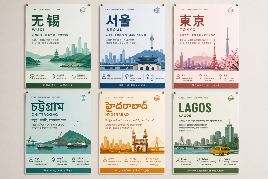
The claim that it can handle “every single language” is obviously marketing bravado. But the direction of travel is unambiguous: non‑Latin scripts and non‑English audiences are finally being treated as first‑class citizens in the image pipeline.youtube
For practitioners in India and across the Global South, this is perhaps the single most substantial shift:
- A schoolteacher in Kurnool can, in principle, generate a high‑quality Telugu or Hindi poster explaining fractions, local geography, or climate concepts, without waiting for a state‑approved textbook update.²youtube
- A regional campaign manager can spin up hyper‑local election creatives across Hindi, Bengali, Marathi, and English in an afternoon, instead of coordinating with four different agencies.²youtube
- A product team can test UI mock‑ups that include Tamil or Urdu text, with typography that doesn’t fall apart as soon as you move beyond lorem ipsum.²youtube+1
The technology doesn’t guarantee good usage. It does, however, remove the long‑standing alibi that “the tools just don’t support our language properly”.
The uncomfortable flip side: whoever controls the prompts, controls the narratives that flood those languages. Large parties, platforms and corporations who adopt these tools fastest will shape the visual language of politics, culture and commerce in scripts historically marginalised by the global design stack.
If you work in these regions, your responsibility is to keep that power visible – to make it clear that these posters, these infographics, this sudden explosion of crisp Bengali typography, are being mediated by a very particular set of models and choices, not by some neutral engine of progress.
Instruction following and the automation of spatial intelligence
Another demo, led by OpenAI researcher Jianfeng Wang, focuses on instruction following. The examples are almost comically specific:youtube
- A woman from the shoulders up, holding the word ‘the’ in her right hand and ‘view’ in her left, composed as magazine word art.⁴youtube
- Clocks where each hand and numeral must be precisely positioned as requested, testing the model’s ability to align text and spatial constraints.⁴youtube
In previous generations, these kinds of prompts produced something like a hallucinated compromise: the text sort of there, the clock vaguely correct, but nothing you would trust as more than a rough sketch. Here, the system gets close enough that the demo can pass without nervous laughter.youtube
If you build interfaces, data visualisations, or marketing layouts, pay attention to what’s being automated:
- Converting highly detailed positional briefs into coherent compositions without manual nudging.
- Maintaining consistency across variations – e.g. all your regional posters following a shared grid and hierarchy generated from a single master prompt.youtube+1
This is deeply attractive for overstretched teams. It is also a recipe for homogeneity if you’re not careful. When prompt‑driven layout becomes the norm, the path of least resistance is to reuse the same base prompts, the same structural patterns, the same visual idioms.
You get speed, but you also get sameness. And sameness is culturally expensive.
Chameleon storytelling and the new visual monoculture
The ‘Chameleon’ video shows a different kind of ambition. Every frame of a narrative short is generated with ChatGPT Images 2.0, morphing styles while maintaining coherence. It is pitched as “a new form of storytelling”.youtubeyoutube
For marketers and content teams, the appeal is obvious:
- Test multiple visual identities and storyboards at negligible cost.
- Swap illustration styles per platform – a painterly reel for Instagram, a flat graphic for LinkedIn, a manga‑style teaser for YouTube – while keeping the core narrative intact.youtubeyoutube
The structural risk is subtler.
When a single model family becomes the default engine for concept art, storyboards, social content, explainer videos, and campaign imagery, it also becomes the default supplier of taste. Its biases – towards certain colour palettes, camera angles, character designs, even body types – propagate into everything from indie games to government explainer films.
This isn’t unique to OpenAI. It is a platform logic problem. But Images 2.0 accelerates it by collapsing previously separate workflows (moodboard, storyboard, poster, infographic, documentation) into a single, promptable surface.youtubeyoutubeyoutube
If you care about distinctiveness, your job now includes:
- Deliberately resisting the first, second, even third set of outputs, which will tend to converge on the model’s aesthetic centre of gravity.
- Fine‑tuning or styling on top of model outputs to maintain a recognisable brand fingerprint.
- Occasionally throwing prompts in directions the model dislikes, simply to see where the seams are.
Otherwise, you wake up in a world where every brand video looks vaguely like an OpenAI launch clip.
The uncomfortable boon: propaganda, persuasion, and cheap polish
None of the official videos says the word, but the subtext is inescapable: this is also the most efficient political poster maker ever released.
Consider the combined effect of the features being highlighted:
- High‑resolution, text‑perfect posters in virtually any language.youtube+1
- Rapid multi‑variation generation for testing different slogans, images, and framings.youtube+1
- Reasoning‑plus‑web‑search claims that suggest the model can assemble persuasive narratives and supporting “facts” on visual demand.techradaryoutube
In India’s electoral and communal context, the leap from “multilingual education posters” to “micro‑targeted communal propaganda” is not hypothetical. It is scheduled.
As a practitioner, you may not be building political tools. But the same mechanisms apply in commercial persuasion: health claims, financial promises, algorithmically optimised fear or aspiration. AI makes such campaigns cheaper, more localised, and harder to distinguish from human‑produced material.
The ethical question for teams is no longer “should we use AI?” It is:
- Where will we refuse to use AI visual generation, even if it is cheaper and faster?
- What disclosure norms will we adopt when we do use it?
- How much verification – legal, factual, cultural – will we insist on before shipping something that looks polished but was assembled by a non‑expert system?
If Images 2.0 is the new Photoshop, then we need the equivalent of media literacy for AI‑generated layouts, not just for face‑swapped videos.
What should practitioners actually do differently?
It is easy to either panic or shrug at a launch like this. Neither response is useful. The more productive stance is to treat Images 2.0 as a forcing function for sharpening your own practice.
For designers
Stop thinking of AI as “junior designer replacement”. Start treating it as a very fast, slightly tasteless collaborator.
- Use it to generate structured first drafts: full posters, multi‑page layouts, explainer diagrams – but review them like you would a freelancer’s work, not a finished product.youtube+1
- Protect time for concept and critique: your defensible value now sits in deciding what’s worth making, and spotting where the model’s polish hides conceptual laziness or ethical problems.
- Develop an internal vocabulary for model‑style: document the tropes it keeps falling into, and decide which you’ll embrace and which you’ll actively avoid.
For marketers
Treat the multilingual and layout capabilities as an opportunity to de‑centre English and template‑driven campaigns – not just to mass‑produce more of the same.
- Pilot regional campaigns where the local language is primary, not an afterthought, with creative decisions made by people who actually speak it.youtube
- Build disclosure into your brand guidelines: if an asset is AI‑generated, decide whether, where, and how you say so.
- Be ruthless about factual claims in AI‑generated infographics. Have a human owner whose job is to say “no” to anything that can’t be justified.
For PMs and product teams
Assume that “image as answer” will creep into your product whether you plan for it or not. Better to design for it explicitly.
- If you embed Images 2.0 for help, education, or dashboards, require that every visual answer has a text or data counterpart a user can inspect.
- Instrument trust metrics, not just engagement: track how often users ask follow‑up questions, request clarification, or override AI suggestions. A lack of friction might mean over‑trust, not satisfaction.
- Treat reasoning time as a design element. If the model needs a “pause before creation” to do its best work, make that delay meaningful – show thinking steps, choices, or alternative approaches instead of a loading spinner.techradar
For developers
Stop treating these models as black‑box APIs plugged in at the last minute.
- Expose toggles that matter: resolution, aspect ratio, safety filters, watermarking. Don’t bury them.
- Log not just prompts and outputs, but where in the product those outputs are used, so you can audit failures in context.
- Always assume the system will fail worst on edge‑cases that matter culturally: minority languages, sensitive topics, small devices, low bandwidth connections. Test there first.
The thread through all of this is simple: the more the model takes over the surface layer of work, the more you must own the underlying intent, accountability, and differentiation.
The real shift: from designing images to designing dependence
The story OpenAI wants to tell is that we’ve moved from “images to marvel at” to “images to discover and navigate, to invent and build, to dream and explore the world”.¹ That line is not just poetic. It’s strategic.linkedinyoutube
If images become not just decoration but a primary way of navigating knowledge, then the system that generates those images becomes a gatekeeper, not a tool. Images 2.0, integrated into ChatGPT, is a quiet land‑grab for that role.linkedin+1youtube
For practitioners, the uncomfortable but necessary response is to stay with the contradiction:
- Use the capabilities. Ignoring them is professional negligence.
- Refuse the dependency. Do not let a single model decide what your work should look like, or what your users should see as “the answer”.
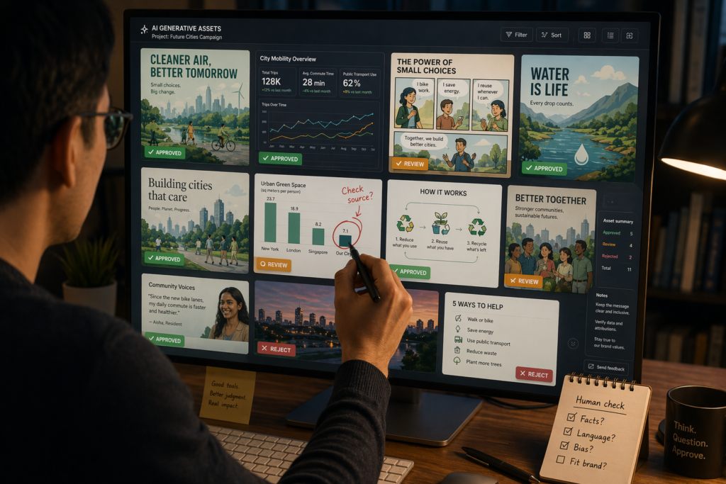
Because in the end, the risk is not that interfaces become frictionless. It is that our judgement does.
The model can now draw your world with remarkable precision. What you still have to guard, fiercely, is the choice of which world gets drawn.
Footnotes
- OpenAI, ‘This is ChatGPT Images 2.0’, YouTube launch video, April 2026.linkedinyoutube
- OpenAI, ‘Multilingual & Text Rendering with ChatGPT Images 2.0’, YouTube demo, April 2026.youtube
- TechRadar, ‘“Not just generating images. It’s thinking” — ChatGPT Images 2.0 could fundamentally change AI art’, April 2026.techradar
- OpenAI, ‘Instruction Following with ChatGPT Images 2.0’, YouTube demo, April 2026.youtube
- OpenAI, ‘ChatGPT Images — Chameleon’, YouTube short film, April 2026.youtubeyoutube