Big ideas. Small screen.
Research deserves a good reading experience. Even when the reader is holding it in one hand.
- Publication
- ISB Insight
- What I made
- App concept, mobile interface design
- Focus
- Content discovery and reading
- Audience
- Readers of research and institutional insights
- Screens
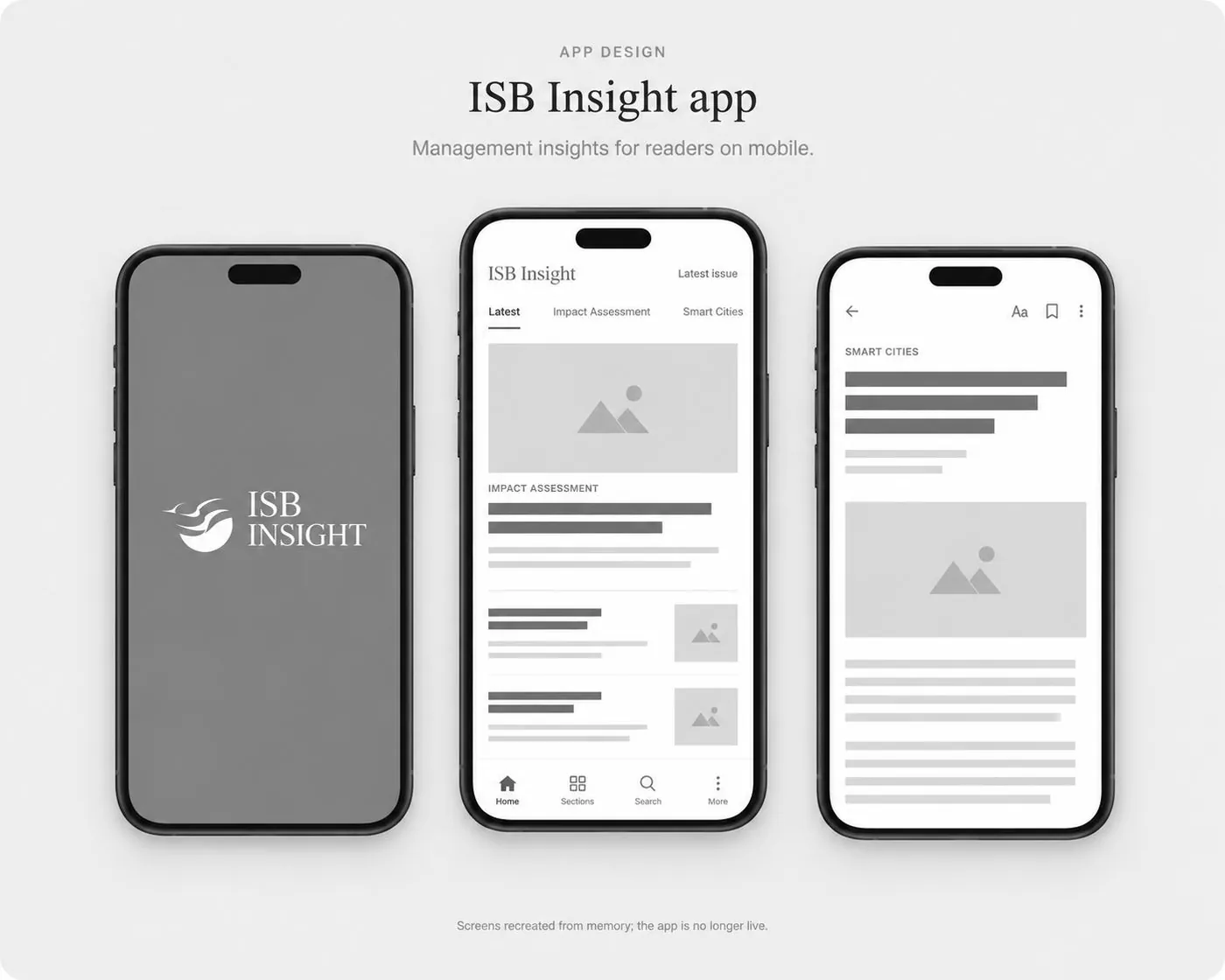
- Recreated from memory
I developed the idea for the ISB Insight app to bring research and institutional insights into a dedicated mobile experience.
The ambition was simple: help readers find an interesting idea, get into it and give it their attention—without the interface asking for equal billing.
The challenge: make room for substance
Research-led content has depth. A phone has limited space.
The design challenge was to bring the two together: make content approachable without flattening it, and make navigation useful without letting it take over.
This wasn’t about squeezing a website onto a smaller screen. It was about thinking through how the content could belong there.
What I made
App concept · Mobile interface design
I shaped the app’s concept and contributed to its mobile interface, bringing editorial thinking into the design of the reading experience.
The screens shown in this portfolio are recreated from memory. The original app is no longer live.
The approach: a publication first, an interface second
Give readers a way in
Before someone reads an article, they need a reason to choose it.
I approached the design around that editorial journey: encountering a story, recognising its relevance and deciding to explore further.
The aim was clarity. Readers should spend their attention on the ideas, not on figuring out where to go.
Make hierarchy do the heavy lifting
On a small screen, everything cannot come first.
The design focus was to establish a clear relationship between the content and its presentation—helping readers distinguish what to notice, what to explore and what to read.
Less visual competition. More room for the material.
Let the interface step back
Discovery and reading call for different things.
The first needs direction. The second needs space.
I wanted the experience to support that transition: help readers reach the content, then let the content lead. The interface had a job to do, not a speech to make.
Keep the publication’s character
Making research accessible did not mean making it lightweight.
The concept needed to balance an approachable mobile experience with the substance of ISB Insight’s research and institutional content.
Serious ideas. No unnecessarily serious obstacles.
My contribution
- Conceived the mobile app experience for ISB Insight.
- Helped shape the interface around content discovery and reading.
- Connected editorial priorities with the presentation of research-led content.
- Recreated screens from memory to document the project.
What the project demonstrates
This project shows how I connect content strategy with interface design: starting with what people come to read, then considering how the experience can help them reach it.
It is a retrospective design case, not a measured performance claim. The recreated screens illustrate my recollection of the work; they do not establish adoption, engagement or reading-completion results.
The takeaway
The goal wasn’t to make research shorter.
It was to shorten the distance between a reader and an idea worth spending time with.
Portfolio note: The original app is no longer live. Screens are recreated from memory and may differ from the released version.