Form & Dwell
A website with room to breathe.
- Project
- Form & Dwell
- Type
- Self-directed concept, not a client commission
- What I made
- Website design concept
- Focus
- Visual hierarchy and page composition
- Approach
- Considered, not complicated
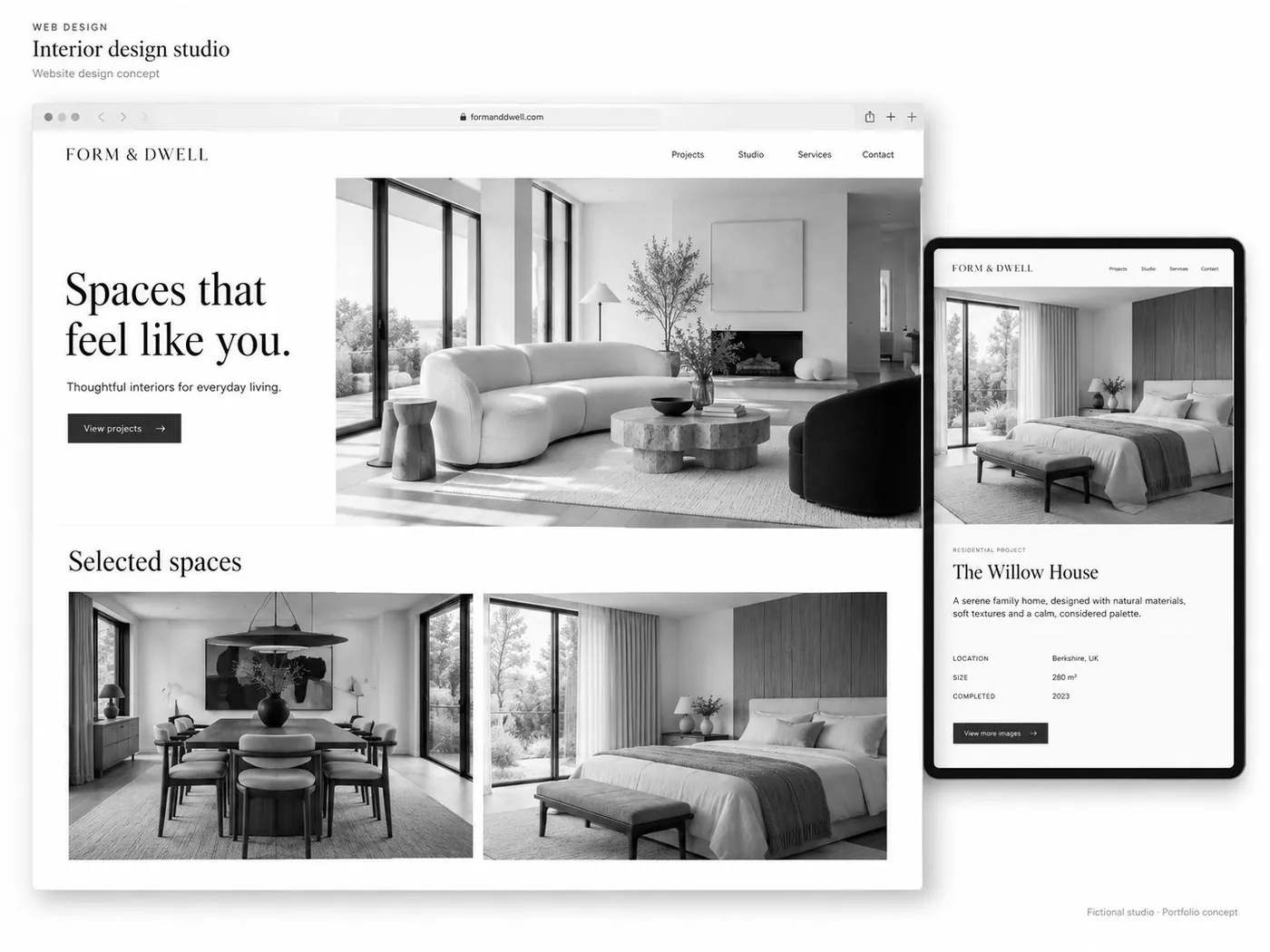
For Form & Dwell, I explored a web design concept built around a simple idea: give the content space, and give the visitor a clear way through it.
The name suggested a design direction—considered, composed and welcoming. I used that as the starting point for an interface where presentation and purpose could sit comfortably together.
Good looks were invited. They weren’t allowed to run the meeting.
The challenge: make restraint do something
A pared-back website still needs to communicate.
Remove too little, and the page feels crowded. Remove too much, and visitors are left admiring the empty space while wondering where to click.
The conceptual challenge was to balance character with clarity: create a distinctive experience without making the interface the main event.
What I made
Form & Dwell · Website design concept
A self-directed exploration of visual hierarchy, page composition and the relationship between content and interface.
This was a concept project, not a commissioned client website.
The approach: considered, not complicated
Give the page a clear point
I approached the concept around the idea that each page should establish what matters.
The visual hierarchy needed to help visitors distinguish an introduction from supporting information and a next step from decoration.
Not everything needed to make an entrance.
Make space earn its place
Space was part of the design direction—not an excuse to leave the page unfinished.
The intention was to give content enough separation to feel deliberate, while keeping related information connected.
Room to breathe. Still something to say.
Let personality support the experience
The name Form & Dwell offered a starting point for a composed visual identity.
I explored how that character could carry through the interface without relying on unnecessary complexity. The aim was an experience that felt coherent, rather than a collection of individually impressive sections.
Keep the next step in view
The concept considered how visitors could move through the content, not simply how a page might look in a portfolio.
A website should offer more than a good screenshot. It should suggest somewhere useful to go next.
What this project demonstrates
Form & Dwell provided space to explore the connection between visual design and communication.
The focus was on how composition, hierarchy and content could work together to create a clear, distinctive web experience.
As a concept project, it does not carry claims about client results, user testing, conversions or commercial performance.
The takeaway
The ambition was a website with presence, not noise.
Form & Dwell explores how a restrained interface can still have character—and how a clear structure can make room for it.