The stories could take the scenic route. The navigation couldn’t.
What designing Elsewhere, an India-led travel magazine app concept, is teaching me about editorial thinking and user experience.
- Project
- Elsewhere, a fictional travel magazine
- Type
- Independent app design concept
- Focus
- Story-led discovery, with magazine issues
- Screens
- Home, Explore, Search, Article, Library, Issues
- Status
- Concept; not yet tested with readers
I started with what looked like a visual exercise: redesign a travel magazine app.
Then the questions became less about how the screens should look and more about what readers should be able to do.
How would someone find a story? What would make them open it? Where would it go when they saved it? And would they understand the difference between saving something and downloading it?
The attractive-screen exercise had quietly become a lesson in structure.
First, I had to decide what I was designing
My starting reference was a set of app-store screenshots showing magazine editions, search, saved content and settings.
It would have been easy to look at those screens and declare everything that wasn’t visible “missing”. But a screenshot is not a product audit. It shows a particular state, not every feature or journey.
That distinction changed how I approached the exercise.
Instead of asking, “What is wrong with this app?”, I asked, “What kind of reading experience do I want to explore?”
A digital edition reader and an editorial discovery app have related but different priorities. One helps people access an issue. The other helps them find individual stories.
For Elsewhere, my fictional travel magazine, I chose to explore story-led discovery, with magazine issues remaining part of the experience.
That decision gave the concept a direction. Without it, I could have spent days rearranging a home screen without knowing what it was supposed to achieve.
“Make it India-led” changed more than the photographs
The first generated screen concept led with Japan. I asked for an India-led version.
That might sound like an image swap. It became a more useful editorial decision.
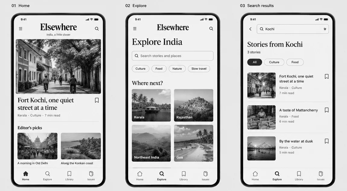
The revised concept led with Fort Kochi and included stories and destinations across Kerala, Old Delhi, the Konkan coast, Rajasthan, Northeast India and Goa. The issue itself became India-focused.
The change made the content feel more specific. I was no longer designing a generic travel interface with interchangeable beautiful places.
It also made me think about how a publication’s point of view reaches into its interface. What leads the home screen? Which destinations appear in discovery? What kinds of journeys get grouped together?
Those are editorial choices, even when they appear as cards, tabs and labels.
A home screen is an editorial decision
My instinct, coming from communication and publishing, is to ask what deserves attention.
That turned out to be useful here.
The home-screen concept needed a lead story, supporting recommendations and a route into the magazine. Each element needed a role. Otherwise, the page risked becoming a collection of equally enthusiastic rectangles.
Designing the hierarchy meant deciding:
- What should introduce the publication?
- What should invite further exploration?
- What information helps someone choose a story?
- What can wait until they open it?
The challenge wasn’t to make everything visible. It was to make the priorities understandable.
A home screen cannot give everything top billing. Neither can an editor.
Saved and downloaded are not the same promise
One of the most useful distinctions in the exercise was also one of the least glamorous.
A saved story means, “I want to return to this.”
A downloaded story means, “I can access this without a connection.”
Those are different expectations. The Library concept therefore distinguished saved content, downloads and reading in progress, with an explicit offline label where relevant.
I began to see these labels as small promises. If the interface makes a promise, the rest of the experience needs to keep it.
That is a different way of thinking from simply asking whether the Library screen looks tidy.
Reading needs a different rhythm from browsing
The discovery screens could be expressive. The article screen needed to settle down.
In the generated concept, the article view brought together a headline, standfirst, byline, reading time, image and text-size control. It explored how readers might move from an interesting photograph into the substance of a story.
The important question wasn’t how many features I could place around the article. It was which controls deserved to interrupt the reading experience.
I wanted to explore an interface that helped readers arrive, then stepped back.
The story could have personality. The surrounding furniture didn’t need to keep introducing itself.
AI helped me make the questions visible
I used AI-generated mockups to turn the design brief into a set of screens: Home, Explore, Search Results, Article, Library and Issues.
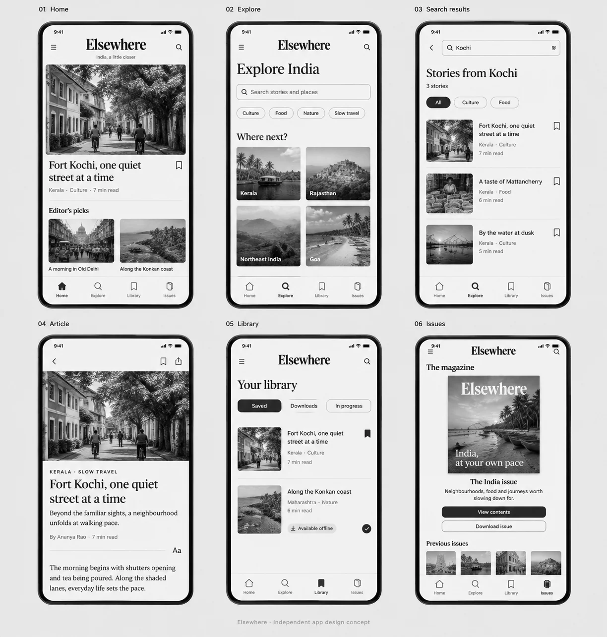
That made the concept tangible. It also made it easier to spot decisions that needed more thought.
But a convincing mockup is not a working app. It does not prove that navigation makes sense, text remains usable at larger sizes or people can retrieve a saved story without assistance.
I’m treating these screens as material to examine—not evidence that the experience is finished.
The useful part of AI assistance was being able to move from an abstract idea to something I could question. The judgement still sits in deciding what belongs, what is consistent and what needs testing.
What I haven’t established yet
Elsewhere is a learning concept, not a launched product.
I haven’t demonstrated improved engagement, easier navigation or better reading completion. Those would require testing rather than a persuasive portfolio paragraph.
The next step is to turn the screens into a connected prototype and observe whether people can:
- Find a story that interests them.
- Understand what they can read.
- Save a story and retrieve it.
- Distinguish saved content from offline content.
- Move from browsing into reading without confusion.
Their hesitation would be useful information. So would the places where my explanation sounds clearer than the interface.
What I’m taking from the exercise
I began by thinking about an app redesign. I’m learning to think about the decisions underneath it.
Content hierarchy. Navigation language. Reading states. Editorial identity. The difference between a feature that looks useful and a task someone can actually complete.
My editorial background gives me a starting point: I know how to ask what matters to a reader. Interface design asks me to carry that question further—into the choices, controls and transitions around the content.
That is the part I want to keep learning.
Elsewhere is a fictional publication. The work of deciding what belongs where is real.
Elsewhere is an independent, India-led travel magazine app concept.