A film school needs more than a good opening shot.
For AISFM, a film and media school, I worked on a WordPress website in 2014.
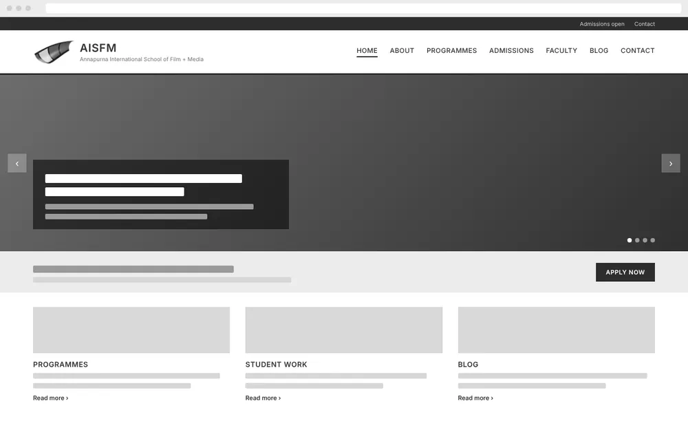
- School
- AISFM, a film and media school
- Year
- 2014
- What I made
- WordPress website
- Focus
- Creative character with a clear structure
- Screens
- Recreated from memory
The brief, in its simplest form: give a creative institution a digital home. A place that could introduce the school while helping visitors find their way into the information.
The visual experience mattered. So did what happened after the first impression.
The challenge: character, without the confusion
A film and media school gives a website plenty of creative territory. The design challenge is knowing what to do with it.
I approached the project around a balance: express the institution’s character without making the visitor work too hard to understand the site.
The website needed to be an introduction, not an audition for the visitor’s patience.
What I made
A WordPress website for AISFM
The project brought together website presentation, content organisation and the practical demands of working in WordPress.
The original website is no longer online. The version shown in this portfolio is recreated from memory, not an exact archive of the 2014 site.
My approach: give the story a structure
Make the first impression useful
A website can establish a mood and still leave people wondering what they are looking at.
My design focus was to connect the school’s creative identity with a clear introduction—giving visitors a sense of the institution without asking the visuals to do all the explaining.
Personality was welcome. Guesswork wasn’t.
Give content a clear hierarchy
I considered how information could be organised and presented so visitors had a way into the site.
That meant thinking about what should attract attention first, what needed explanation and how the pages could work together.
The aim was clarity, not a competition between everything on the screen.
Balance expression with usability
The creative subject matter was an opportunity, but the interface still had a job to do.
I wanted the presentation to support exploration rather than become an obstacle to it. The school could supply the drama; finding information didn’t need any.
Work within WordPress
WordPress provided the foundation for the website.
The project involved thinking about the site as a connected set of pages and content—not simply a collection of individual layouts. The presentation needed a consistent structure behind it.
My contribution
My work centred on the WordPress website and its presentation, connecting the institution’s identity with the organisation of its content.
This case reflects an early intersection of my interests in communication, digital publishing and interface design: how to introduce an organisation, give its information a useful shape and help people explore it.
Looking back at the work
This is a retrospective project, reconstructed from memory.
The portfolio recreation illustrates my recollection of the website. It should not be treated as a precise record of the original design, functionality or content.
No traffic, enquiry or conversion results are claimed here. The case demonstrates the design work and its intent—not a performance story assembled after the credits.
The takeaway
The aim was a website with creative character and a clear structure.
Something that could introduce the school, hold the content together and let visitors get on with exploring.
A good opening shot matters. So does the rest of the story.
Portfolio note: Website project dated 2014. The original site is no longer online; the portfolio version is recreated from memory.