The interface owes you an explanation
The foundational UI/UX thinkers who shape how I approach design, communication and AI
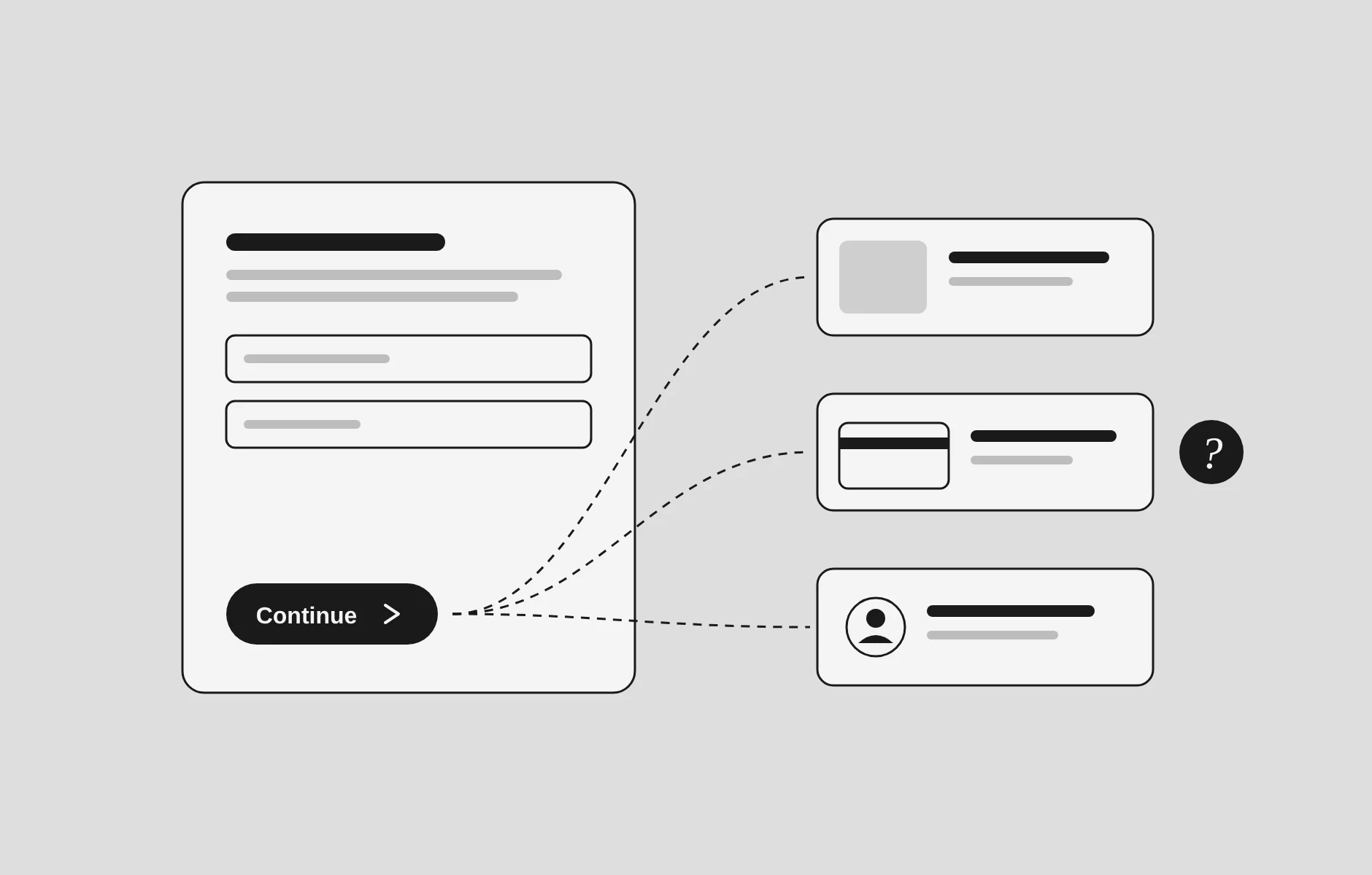
A button labelled “Continue” can conceal a surprising amount of information.
Continue to what? A preview? A payment? An account I did not intend to create? Somewhere, a team has debated its colour, adjusted its corners and checked whether it fits the design system. The more consequential question is whether anyone knows what will happen after pressing it.
This is where my interest in design begins. Not with the screen as an object to admire, but with the person trying to get something done.
My work crosses communication, content, websites and AI enablement. Across those areas, I keep returning to the same questions. What does someone need to understand? What are we asking them to decide? What happens if they get it wrong? How much of the organisation’s complexity have we quietly handed over to them?
The foundational thinkers in UI/UX give me ways to answer those questions. Don Norman, Jakob Nielsen, Ben Shneiderman, Steve Krug, Jesse James Garrett, Peter Morville and Louis Rosenfeld do not offer a shared aesthetic. They offer something more useful: different ways to examine the relationship between people and systems.
That distinction matters now. An AI interface can produce an answer without making its limits clear. A website can look finished while leaving its purpose unresolved. An automated workflow can remove a step and, with it, the moment when someone understood what they were authorising.
My position is straightforward: the more a system can do, the more clearly it should explain itself.
The quality I look for is legibility. Not simply whether people can read the words, but whether they can understand the situation, judge their options and act without surrendering control.
Don Norman: confusion is a design problem before it is a training problem
There is something quietly radical about refusing to blame people for struggling with an object.
Norman’s work offers that refusal. In The Design of Everyday Things, he examines how products communicate their operation. His distinction between affordances and signifiers is particularly useful: affordances concern what actions are possible; signifiers are the perceivable cues that help people discover those possibilities. A system may permit an action without making it apparent.
The familiar door with a pull handle on the side that requires pushing captures the problem neatly. The object says one thing; the instruction says another. Norman documents precisely this contradiction in a university’s glass doors, which had identical handles despite opening in only one direction.
The digital equivalent is less physically embarrassing but just as revealing. Text looks clickable and is not. An icon performs an important action but offers no explanation. A form asks for information without explaining why it is needed.
For me, Norman’s contribution is a change in where to look first. Before writing another instruction, examine the thing that apparently needs explaining.
That matters in organisational change. When people struggle with a new workflow, “more communication” can become the default remedy. But communication cannot always compensate for a process whose controls, terminology and consequences contradict one another.
Consider an illustrative AI policy hub. Employees are told to use approved tools, yet the list is buried under a department name they would never search for. Another awareness campaign might raise recognition of the policy. It would not necessarily make the approved tools easier to find.
Norman’s human-centred design principles push beyond the visible symptom: address the underlying problem, focus on people, examine the wider system, and test and refine proposed solutions.
The question I take into my work is therefore not just “Have we explained this?”
It is “What is the design already telling people—and is it telling the truth?”
Jakob Nielsen: people should not have to guess what the system is doing
A surprising amount of interface frustration is uncertainty dressed as inconvenience.
Did the upload finish? Was the payment submitted? Has the change been saved? Is the system waiting for me, or am I waiting for it?
Nielsen’s usability heuristics turn those moments into examinable design problems. They cover system feedback, consistency, error prevention, recognition rather than recall, recovery and user control. They are broad rules of thumb, not a recipe for every interface. Their value is that they make a critique specific.
“Something feels wrong” becomes “The system has not acknowledged the action.”
That is a much better starting point for fixing it.
Nielsen Norman Group’s research on shopping carts provides a concrete example. After someone selects “Add to cart”, the interface needs to confirm what happened clearly enough to be noticed. A small change to an item count may not be sufficient. The shopper should understand that the item was added and what they can do next.
This is not decorative reassurance. It is information required to continue the task.
The same principle applies to a consulting enquiry form. After submission, “Thank you” is polite but incomplete. A more useful confirmation explains whether the enquiry was received, what happens next and, where there is a genuine commitment, when to expect a response.
AI makes the distinction between activity and useful feedback more important.
A moving animation tells me that something is happening. It does not tell me whether the system is searching documents, drafting a response or preparing an action. Nor does fluent output tell me what evidence supports it.
Microsoft’s research on human–AI interaction extends this concern explicitly. Its guidelines address communicating capabilities and likely performance, supporting correction, and helping people understand system behaviour when things go wrong.
Nielsen gives me a discipline I can apply to a screen, a form or a workflow: identify the moment when the person has to guess, then ask what information would remove that guesswork.
Not every wait needs a progress bar. Every consequential interaction needs appropriate feedback.
Ben Shneiderman: control needs to exist, not merely be promised
“Human in the loop” sounds reassuring. It can also be an unusually efficient way to avoid describing the human’s actual powers.
Can they stop the action? See what changed? Reject part of the result? Recover an earlier version? Or are they simply present when the system finishes?
Shneiderman’s Eight Golden Rules make control concrete. Alongside consistency and informative feedback, they call for error prevention, easy reversal, reduced memory demands and keeping users in control. His explanation of reversibility makes an important connection: knowing that mistakes can be undone reduces anxiety and encourages exploration.
That relationship is easy to overlook. A person who appears reluctant to use a tool may be responding sensibly to the cost of making a mistake.
Take an illustrative AI-assisted publishing workflow. A system proposes changes to a page.
One design offers a single “Apply improvements” button. Another shows the proposed edits, allows individual acceptance, preserves the original and separates approval from publication.
Both may be described as human-supervised. Only the second gives the person meaningful opportunities to inspect and intervene.
This is where I find Shneiderman especially useful for AI enablement. “Build trust” is too vague to guide a design decision. “Allow the user to reject this change without losing the rest of the work” is actionable.
His principle of closure matters too. A sequence should have a recognisable end, with feedback that lets someone understand that the task is complete.
In a workplace process, that might mean distinguishing “submitted” from “approved”. In publishing, it means distinguishing “saved” from “published”. In AI, it may mean distinguishing “draft generated” from “action executed”.
Those are not minor wording preferences. They describe different states of responsibility.
The practical question is simple: where, exactly, does the person retain control?
If the answer cannot be demonstrated in the interface or workflow, it remains a promise.
Steve Krug: do not spend the reader’s attention on your navigation
I work with words, which makes me particularly suspicious of language that exists mainly to impress its author.
A navigation label can be elegant and useless. A service description can sound distinctive while failing to describe a service. A page can insist that it offers “possibility” when the visitor is trying to find out what can actually be bought.
Krug’s Don’t Make Me Think offers a useful counterweight. Written to make usability knowledge accessible beyond specialist teams, it treats reducing unnecessary frustration as practical work that many people involved in a product can do.
I do not read its title as an argument against intellectual effort. Some things deserve careful thought: choosing a supplier, understanding a risk, reading an essay.
Finding the menu should not require the same investment.
That distinction shapes how I approach editorial and website design. I want the reader’s attention available for the argument, not consumed by decoding the structure around it.
Imagine a consultancy menu with three items: “Possibilities”, “Perspectives” and “Let’s evolve”.
There may be a coherent internal explanation for each. The visitor does not have access to that meeting.
“Services”, “Articles” and “Contact” may be less glamorous. They also leave more room for character where it belongs: in the writing, the point of view, the examples and the quality of the offer.
The choice is not between personality and usability. It is between personality that helps orient someone and personality that asks them to do extra work.
Krug’s influence also encourages a degree of modesty. What feels obvious to the person building a page is a hypothesis. Someone unfamiliar with it should be able to attempt a real task without the designer supplying a running commentary.
If I have to stand beside a page explaining how to use it, the page has not yet finished its job.
Jesse James Garrett: a visual redesign cannot resolve an unclear offer
A website redesign often begins with the most visible material: fonts, colours, photographs, spacing.
Those decisions matter. They are also attractive because they make progress visible. A new palette can be approved in a meeting. An unresolved question about whom the organisation serves is less accommodating.
Garrett’s five planes of user experience—strategy, scope, structure, skeleton and surface—offer a way to see the dependencies beneath the finished screen. The framework moves from objectives and needs towards the interface’s concrete form.
I find it useful because it interrupts the urge to solve everything at the surface.
Suppose a consulting website looks polished but visitors cannot identify the service relevant to them.
At the strategy level, the intended audience or business objective may be unclear. At the scope level, the site may omit the evidence someone needs. At the structure level, it may separate a service from its supporting case study. At the skeleton level, it may hide the next step. At the surface level, weak contrast may make that step difficult to see.
“Improve the design” is not a sufficiently precise brief. These are different problems.
For a service page, I would use Garrett’s framework to work through a sequence:
- What decision is this page helping someone make?
- What information do they need to make it?
- In what order should that information appear?
- How should the page guide attention and action?
- What visual treatment makes that structure clear?
This is an application of the framework, not a claim that design proceeds neatly in one direction. Drafting a page often exposes weaknesses in the offer itself. A heading refuses to become clear because the underlying proposition is not clear.
That is valuable information.
Garrett helps me resist polishing a sentence whose problem is actually a business decision. Sometimes the right next move is not a better headline. It is a more honest conversation about what the service does.
Louis Rosenfeld and Peter Morville: information needs a usable address
Organisations often confuse storing information with making it available.
A document exists. It has been uploaded. Its location is known to the person who uploaded it. From inside the organisation, the task appears complete.
For everyone else, it may as well be in a cupboard.
Rosenfeld and Morville’s work on information architecture gives organisation, labelling, navigation and search the attention they deserve. Their foundational book treats the structure of information as a design problem in its own right.
This connects directly with my work in communication and organisational change. People cannot act on guidance they cannot locate. A beautifully written policy does little at the moment of decision if its title, location and surrounding labels make sense only to its authors.
Consider an illustrative employee AI hub. Its navigation could mirror the organisational chart: IT, legal, information security, learning and development.
Or it could begin with employee questions:
- Which tools can I use?
- What information can I upload?
- How should I check an answer?
- Where do I report a problem?
The departments still need to own their material. Employees should not need to reconstruct those ownership arrangements to find an answer.
Morville’s UX Honeycomb broadens the assessment further. An experience should be examined for usefulness, usability, desirability, findability, accessibility, credibility and value. Usability matters, but it is not sufficient on its own.
That gives me a way to resist vague approval.
“The page looks good” tells us little about whether its guidance is credible. “The search works” does not establish that the results answer the question. “People can use it” does not establish that it provides anything worth using.
Morville’s own account of work for the National Cancer Institute is particularly instructive. He describes using findability concepts and search data to challenge an excessive focus on the homepage and draw attention to documents people could reach directly through search engines.
The homepage was not the whole experience.
That remains a useful corrective for anyone designing a website or knowledge resource. A page should make sense to someone who arrives there first, without the tour the organisation imagined they would take.
What I keep—and what these frameworks cannot do for me
These thinkers inspire my work because they make it harder to hide behind taste.
Norman asks whether the design communicates its operation. Nielsen makes usability problems diagnosable. Shneiderman asks what control the person actually has. Krug protects attention from needless effort. Garrett exposes the decisions beneath the screen. Rosenfeld and Morville make information structure and wider experience quality visible.
But a framework is not a permission slip.
An interface can be consistent, easy to navigate and highly effective at persuading people to do something against their interests. A clear confirmation can document a choice that was never fairly presented. Making an action easier does not automatically make it worth encouraging.
That is why I do not want to treat these ideas as commandments detached from context. Norman’s later argument for humanity-centred design explicitly expands the focus beyond individual users to communities, ecosystems and long-term effects.
The question must sometimes move from “Can this person complete the task?” to “Who benefits when they do—and who carries the consequences?”
This matters particularly in workplace AI. A faster drafting tool may save one person time while creating checking work elsewhere. An automated recommendation may be convenient while leaving responsibility unclear. Those are questions to investigate, not outcomes to assume.
Microsoft’s human–AI interaction guidelines are useful here because they address the relationship over time, including failure and correction, rather than treating a successful first interaction as the whole story.
The older principles have not become irrelevant. They need to be applied to a wider field of consequences.
The questions I want a design to survive
I do not need every project to display its intellectual ancestry. A visitor should not have to recognise Norman or Garrett to use a page.
I do want the thinking to show up in the decisions.
Before calling something finished, these are the questions I would put to it:
- Can a person tell what this is for?
- Are the available actions apparent, and are their consequences clear?
- Does the system acknowledge what happened?
- Can someone correct a mistake without starting again?
- Is the information organised around their task, rather than our departments?
- Can they identify what is authoritative, current or uncertain?
- Does the experience still make sense without someone explaining it?
Then I want someone unfamiliar with the design to try it. Ask them to find the relevant service, locate a policy, submit an enquiry or correct an error. Watch where they hesitate. Resist the urge to help too quickly.
That hesitation is not an interruption to the design process. It is evidence.
What these foundational thinkers ultimately offer me is a habit of attention: to the uncertainty hidden inside a small interaction, the organisational decision concealed by a label, the work transferred to someone because nobody resolved it upstream.
A useful interface does not need to announce how considerate it is.
It lets you understand what is happening. It gives you a way forward and, when necessary, a way back. It does not require you to admire its sophistication before it helps you.
Start with the button labelled “Continue”.
Tell people where it goes.
Source notes
- Don Norman distinguishes affordances from signifiers and explains the changes in the revised Design of Everyday Things.
- Norman’s account of contradictory door handles provides the physical example discussed above.
- Norman sets out four principles of human-centred design: addressing root problems, focusing on people, taking a systems view, and testing and refinement.
- Nielsen Norman Group’s ten usability heuristics provide the basis for the discussion of feedback, recovery and control. Its shopping-cart research supplies the ecommerce example.
- Ben Shneiderman’s own account of the Eight Golden Rules supports the discussion of reversibility, closure and user control.
- Steve Krug explains the purpose and scope of Don’t Make Me Think on his book page.
- Garrett’s Elements of User Experience resources and the explanation of his five-plane framework support the discussion of strategy through surface.
- Rosenfeld and Morville’s Information Architecture for the World Wide Web supplies the information-architecture foundation. Morville’s original 2004 essay explains the UX Honeycomb and documents the National Cancer Institute example.
- Microsoft Research’s Guidelines for Human–AI Interaction, introduced in a 2019 CHI paper, address initial use, ongoing interaction, failures and adaptation over time.
- Norman’s discussion of humanity-centred design extends the frame to communities, ecosystems and long-term consequences.