Why This Redesign Matters More Than You Think
YouTube’s new interface, released in October 2025, arrived with the force of a sudden storm. The site now sports translucent buttons and floating controls. Comments can disappear or become threaded, just like posts on Reddit. Video suggestions compete for attention, appearing between viewers and the discussions they expect to see.
Immediately, backlash swept across social media. Reddit users voiced frustration, while design-focused Twitter accounts debated the merits and pitfalls. Creators lamented disrupted workflows. Yet, this shift goes beyond pure aesthetics.
At its core, the redesign represents a fundamental power play—altering habits, reshaping control, and redefining the attention economy.
If you work in marketing, are a creator, or rely on digital platforms to reach people, it is vital to understand these changes and adapt your strategy accordingly.
The Redesign: A Closer Look
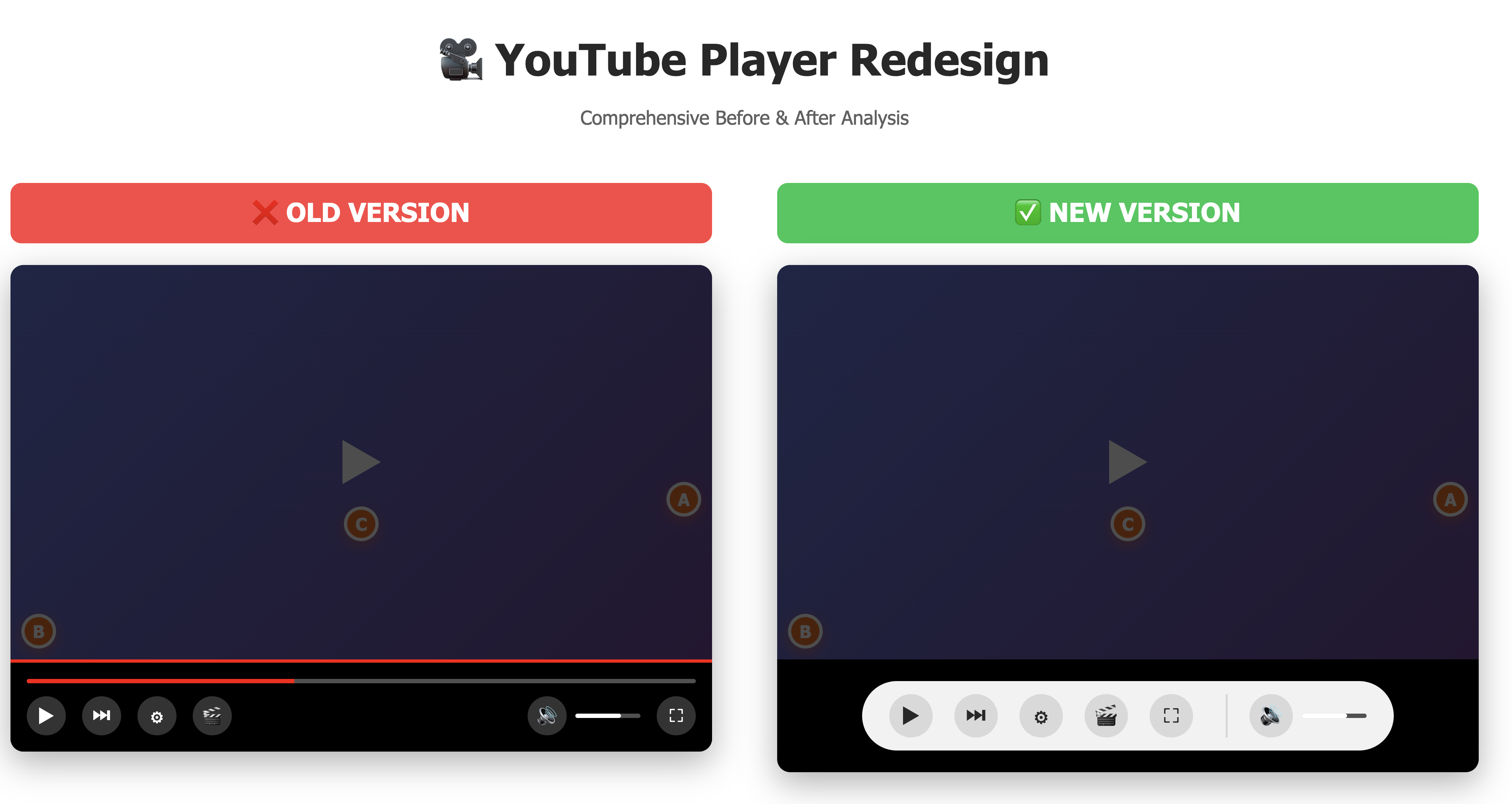
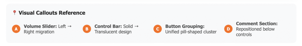
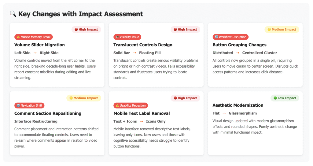
YouTube describes its new video player as “immersive”.¹ Previously, controls formed a solid, unified bar. Now, each button—play, pause, volume—floats separately inside pill-shaped containers.² Their translucency blends with background colours sampled from video thumbnails, creating effects that are sometimes harmonious but often clashing.³
On mobile devices, text labels have disappeared from action buttons, leaving icons as the only guide.⁴ Comments have moved: in some views, they stack as threads; in others, they vanish altogether.⁵ Meanwhile, video suggestions occupy a prominent place directly beneath the player, pushing other content aside.⁶
Influenced by Material Design 3, YouTube’s revision favours soft-edged shapes and adaptive colour schemes that promise a consistent experience across phones, tablets, and TVs.⁷ ⁸ While the intent is to unify the platform visually, the outcome disrupts familiar habits that users relied on for years.
What Works—And Why It’s Not All Negative
There are clear advantages to this overhaul.
Less Clutter, Sharper Focus
A cleaner interface brings greater clarity.
When visual noise is minimised, core content shines through.⁹ This principle of attention design benefits viewers who often feel overwhelmed by extraneous details.
Threaded Comments: Building Structure
Threading comments has introduced order to community discussions, especially under complex videos.¹⁰ Replies now group naturally, making conversations feel cohesive and interactive.
For creators who build communities—such as Swiggy’s campaign that turned delivery partners into ambassadors—threaded comments could enhance loyalty and engagement.¹¹
Consistent Experience Across Devices
Cross-device consistency has become even more important, with users frequently alternating between phones and TVs. Since YouTube now commands upwards of a billion daily viewing hours on connected TVs in the US, this seamless transition cannot be underestimated.⁷ ⁸
Enhanced Branding and Recognition
Channel logos are larger and more prominent, increasing creator visibility and audience connection.¹²
When branding is boosted, viewers are more likely to remember and engage with creators—similar to campaigns that foreground personal stories to drive deeper interactions.
Where the Redesign Stumbles—and What You Should Do
Despite these positives, several issues remain.
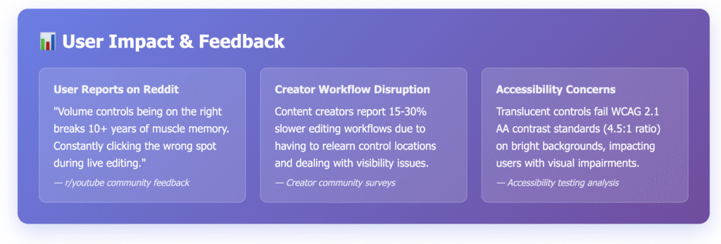
Disrupted Habits and Workflows
Long-standing user expectations were upended. According to Jakob Nielsen’s usability heuristics, systems must align with user mental models.¹³ ¹⁴
YouTube’s interface had barely changed for a decade, helping viewers and creators build “muscle memory”—they knew where everything was. Suddenly, that predictability vanished.
Comments relocated, controls fragmented, and confusion spread across platforms from Reddit threads to design blogs.¹⁵
For creators, this is not a superficial change. It directly impacts efficiency. Every time a familiar feature moves or becomes harder to access, workflow slows and engagement drops. Declines in sharing and conversions often follow broken routines.
Transparency Hinders Readability
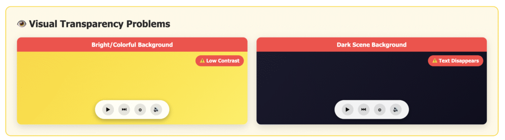
Modern-looking translucent controls may please designers, but they pose real challenges for users. Overlaid icons can become invisible against bright, colourful videos. Dark text on dark backgrounds vanishes, violating crucial accessibility standards.
According to WCAG 2.1 guidelines, minimum contrast is essential, but YouTube’s implementation often falls short.¹⁵ ¹⁶ Many users report difficulty seeing buttons and controls in the new layout.
Adaptive contrast overlays, deployed consistently by other platforms, would solve this problem. However, YouTube has yet to integrate this solution across its player.
Increased Cognitive Load
With controls individually separated and scattered, users must exert extra mental effort to locate functions that used to exist in a single strip. Over time, this increased cognitive load leads to subtle but cumulative friction, causing users to disengage or abandon tasks earlier.¹⁷
Platform Priorities vs. User Intent
Some redesign choices seem intended to maximise watch time by steering behaviour, rather than supporting genuine interaction. For example, video suggestions are strategically placed beneath the player, encouraging viewers to move on before engaging with the current video’s comments or discussion.⁶
From an ethical UX perspective, design should empower users rather than manipulate behaviour.¹⁸ If platforms prioritize short-term engagement metrics over long-term trust, loyalty inevitably suffers.
What Marketers and Creators Should Do Now
Audit On-Screen Branding
Translucent overlays may mask vital on-screen elements. Test your calls-to-action, end screens, and branding across all devices to ensure clarity and visibility. It may seem tedious, but this step is essential for preserving engagement.¹ ²
Strengthen Prompts and Guidance
When interactive buttons are harder to locate, in-video prompts become more crucial. Guide your audience explicitly—both verbally and visually—so they know where and how to interact.
Monitor Metrics Closely
Regularly track your comment rates, shares, and subscriber conversions after major UI changes.¹⁹ Should you detect declines connected to the redesign, adapt quickly: increase prompts, use pinned comments, and foster engagement via the community tab.
Use Threaded Comments to Foster Community
Leverage the new comment structure by pinning engaging questions and starting meaningful threads. This signals real community involvement to viewers and algorithms alike.¹⁰ ¹¹
Sharpen Visual Identity
Prominent logos and colour-blocked descriptions mean branding assets must stand out. Update your channel icons for high recognizability. Preview how thumbnails interact with new UI overlays to prevent accidental dilution of your visual identity.¹²
The Broader Lesson: Platforms Will Always Put Their Interests First
YouTube’s redesign demonstrates the risks of relying too heavily on any digital platform. Platform priorities—ad impressions, watch time, algorithmic control—can conflict with creators’ and marketers’ objectives.
It is crucial to understand core UX principles, recognise manipulative patterns, and adapt swiftly when new designs disrupt established behaviour. Those able to spot problems early and pivot strategies have an edge over competitors.
What Good Redesign Looks Like
Smooth redesigns test openly and iterate gradually.²⁰ They account for different user groups—from power users to people with accessibility needs—and offer opt-outs during transitions. Instead of prioritizing short-term metrics, they measure true success through task completion rates, satisfaction, and equitable access.
Crucially, strong redesigns maintain visibility and minimize cognitive load by grouping related controls and preserving familiar workflows. If engagement drops, responsive teams revert and adjust quickly.
YouTube has the resources to make these improvements. Whether the platform will take action remains to be seen.
Key Takeaways for Marketers and Creators
Design shapes behaviour. YouTube’s latest update highlights the risks of letting platform priorities override user needs. Confusion and friction hurt engagement.
Do not wait for platforms to fix issues—proactively audit your content, test visibility, refine calls-to-action, and monitor results. A robust strategy can weather unpredictable changes.
Ultimately, the interface belongs to YouTube, but your audience remains yours—if you maintain their trust and engagement.
If adapting to shifting platforms feels overwhelming, professional support can transform your digital strategy. Reach out for guidance.
For further insights on adapting campaigns to platform updates, read:
— Swiggy’s campaign: turning delivery partners into storytellers
— KitKat’s phygital break campaign: strengths and failures
Footnotes
- Android GadgetHacks. “YouTube’s Biggest Interface Update in 10+ Years is Here.” 13 October 2025. https://android.gadgethacks.com/news/youtubes-biggest-interface-update-in-10-years-is-here/
- The Verge. “YouTube has a new video player.” 14 October 2025. https://www.theverge.com/news/799492/youtube-new-video-player-update-changes
- TechBound. “Major YouTube Updates October 2025.” 20 October 2025. https://techbound.in/youtube-updates-october-2025/
- Tom’s Guide. “YouTube is rolling out a major UI change.” 1 October 2025. https://www.tomsguide.com/phones/youtube-is-rolling-out-a-major-ui-change-and-some-users-are-not-happy-about-it
- Social Media Today. “YouTube Rolls Out UI Updates, Threaded Comments.” 13 October 2025. https://www.socialmediatoday.com/news/youtube-comment-threading-ui-update-courses-voice-replies/802795/
- Creative Bloq. “Everybody’s roasting YouTube’s new web design.” 16 October 2025. https://www.creativebloq.com/web-design/ux-ui/is-the-new-youtube-ui-design-really-that-bad
- Chrome Unboxed. “YouTube rolls out new video player design and UI updates.” 15 October 2025. https://chromeunboxed.com/youtube-is-getting-a-modern-makeover-with-a-new-ui-rolling-out-now/
- Tom’s Guide. “YouTube rolls out a redesigned video player and people aren’t happy.” 14 October 2025. https://www.tomsguide.com/entertainment/streaming/youtube-rolls-out-a-redesigned-video-player-and-people-arent-happy-heres-whats-different
- TechBound. “Major YouTube Updates October 2025.” 20 October 2025. https://techbound.in/youtube-updates-october-2025/
- TechBound. “Youtube introducing threaded comments & AI- music.” 7 October 2025. https://techbound.in/youtube-double-update-smarter-conversations-endless-ai-tunes/
- Noble Desktop. “Managing Comments and Engagement Effectively on YouTube.” 4 June 2025. https://www.nobledesktop.com/learn/social-media-marketing/managing-comments-and-engagement-effectively-on-youtube
- WebProNews. “YouTube Tests Enlarged Channel Logos in Mobile App to Boost Engagement.” 30 September 2025. https://www.webpronews.com/youtube-tests-enlarged-channel-logos-in-mobile-app-to-boost-engagement/
- UXness. “10 Heuristic Principles – Jakob Nielsen’s Usability Heuristics.” 9 February 2015. https://www.uxness.in/2015/02/10-heuristic-principles-jakob-nielsens.html
- Nielsen Norman Group. “Mental Models and User Experience Design.” 10 September 2024. https://www.nngroup.com/articles/mental-models/
- Reddit. “WTF is This New UI and What do You All Think About It?” 4 September 2025. https://www.reddit.com/r/youtube/comments/1n8nk7k/wtf_is_this_new_ui_and_what_do_you_all_think/
- YouTube. “FIX Color Contrast – Accessibility in Web & UI Design.” 13 March 2023. https://www.youtube.com/watch?v=gdohlUn7fVQ
- Nielsen Norman Group. “Minimise Cognitive Load to Maximise Usability.” 23 October 2024. https://www.nngroup.com/articles/minimize-cognitive-load/
- Desilo Studio. “UX/UI Secrets That Turn Community Members Into Paying Subscribers.” 16 August 2025. https://desilo.studio/blog/ux-ui-secrets-community-members-paying-subscribers/
- Google Developers. “Metrics | YouTube Analytics and Reporting APIs.” 17 September 2025. https://developers.google.com/youtube/analytics/metrics
- YouTube. “A/B Testing for UX Designers.” 8 October 2022. https://www.youtube.com/watch?v=XKPXTF-rYEo
Internal Sources:
- Suchetana Bauri. “Swiggy Wiggy 3.0 Campaign: Employee Advocacy.” https://suchetanabauri.com/swiggy-wiggy-3-0-campaign-employee-advocacy/
- Suchetana Bauri. “Break the Loop, Mind the Bump: A Wry Audit of KitKat’s Latest Musical Break.” https://suchetanabauri.com/break-the-loop-mind-the-bump-a-wry-audit-of-kitkats-latest-musical-break/