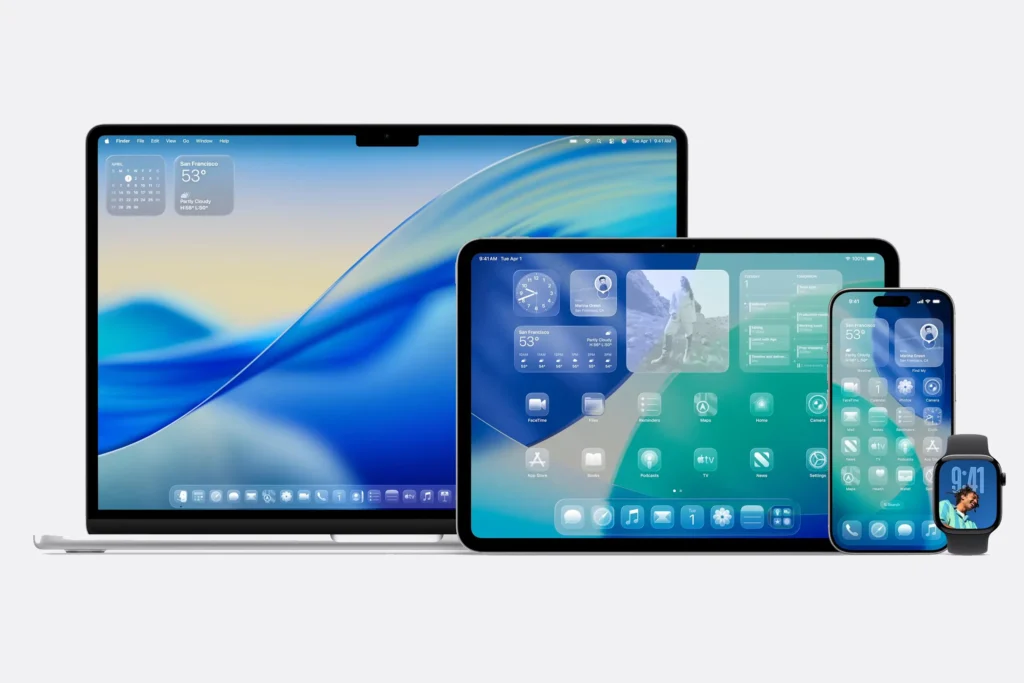
One design language, four screens: Liquid Glass brings the same shimmering translucency to macOS, iPadOS, iOS, and watchOS.
Prologue: The Shimmering Threshold
It began, as so many things in the digital age do, with a shimmer—a promise of clarity, a play of light on glass. At WWDC 2025, Apple unveiled Liquid Glass: not just a new look, but a new lens through which we see and touch our devices. It’s an interface that ripples and refracts, a mood as much as a method. But beneath the spectacle lies a deeper question: What does it mean when our technology stops being a tool and starts becoming a mirror?
Act I: From Pixels to Presence
Apple’s design journey has always been about more than aesthetics. The original Macintosh, with its smiling face, invited us to see computers as companions. The iMac G3’s translucent shell made technology desirable, not just functional. Skeuomorphism brought the familiar into the digital, while flat design stripped it all back to essence.
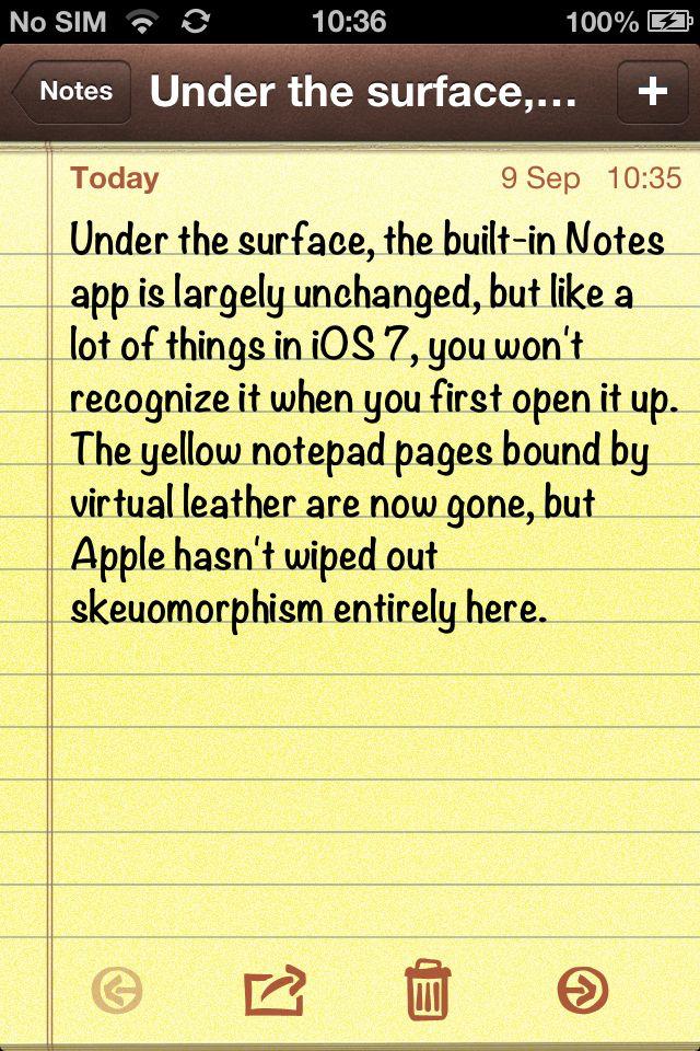
Back when taking a note meant opening a tiny legal pad wrapped in pixel-perfect faux leather—proof that Apple once thought nostalgia was a UI feature.
Now, Liquid Glass signals a new era—one where minimalism gains depth, and simplicity shimmers. This is not just a visual shift, but a philosophical one: the interface is no longer a window or a wall, but a fluid, living surface.
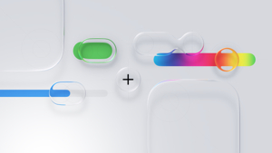
Liquid Glass in its purest form: pill-shaped toggles, a rainbow slider, and a floating ‘+’ icon that look more like droplets of molten interface than ordinary buttons.
Act II: The UX and UI of Liquid Glass—A Technical and Human Canvas
For designers and engineers, Liquid Glass is a marvel of controlled complexity. Apple’s team has built a system of real-time rendering, dynamic translucency, and adaptive color. Every button and notification floats in a layered hierarchy, glass-like surfaces bending light and gently blurring what lies beneath.
Micro-Moments: When Design Gets Physical
Tech Sidebar: Under the Hood
- Rendering Stack: Metal API → real-time Gaussian blur → dynamic lighting layer
- Haptic Feedback: Taptic Engine triggers micro-vibrations on key UI events
- Accessibility Toggle: Settings → Display → Reduce Transparency
- Performance: Animations throttle on older hardware, preserving battery and clarity
- For Figma prototyping: Use blur + brightness layers to mimic the “settling” effect. For devs,
glassEffect()in SwiftUI 5 lets you fine-tune thickness, tint, and light response.
It’s not just what you see—it’s what you feel. With Liquid Glass, the interface isn’t a static backdrop but a surface that reacts, almost instinctively, to your touch.
When an iMessage lands, the bubble ripples once, then settles like pond water—subtle haptic nudge included. Pull down Control Center and the toggles flex, glassy and cool, catching ambient light as your thumb glides past. Even the act of dismissing a notification feels different now: the card bends away, a brief shimmer tracing your gesture before fading into the background.
Unlock your phone in sunlight and watch the lock screen’s glass sheen brighten, as if the device is inhaling the room’s light and exhaling it back through your fingertips.
Act III: Hardware and the Coming Convergence
Apple’s hardware has always been sculpture: aluminum, glass, and geometry. But today’s angular devices feel almost at odds with Liquid Glass’s flowing elegance. This, insiders say, is intentional foreshadowing. The rumored 2027 Glasswing iPhone, with its curved, borderless design, will not just display Liquid Glass—it will embody it.
Tech Sidebar: Hardware Integration
Feature Current (2025) Glasswing (2027) Display Flat OLED Curved MicroLED Frame Aluminum Seamless glass Haptics Taptic Engine Subsurface piezo zones
The future, Apple hints, is not mechanical—it is mineral, organic, and seamless.
Act IV: The UX and UI Debate
Liquid Glass is as divisive as it is dazzling. Alan Dye, Apple’s VP of Human Interface Design, calls it “the most expressive and adaptive interface we’ve ever made.” Designers like Josh Puckett praise its emotional resonance. But critics, like Allan Yu, warn that “it’s challenging to read some elements”—that transparency and motion can blur usability and accessibility.
Tech Sidebar: Accessibility
- Reduce Transparency: Solid backgrounds for clarity.
- Increase Contrast: Boosts text/controls by 30%.
- Performance: Accessibility modes reduce GPU load ~40%.
For every tweet of “Beautiful,” there’s a meme about lost clarity, a Slack thread about eye strain, a forum post about the learning curve.
Act V: The Rituals We Inherit
Apple’s design choices don’t just change how things look—they change how we behave. Liquid Glass nudges us toward a world where the interface is less a tool than an environment, where the rituals of modern life—swiping, tapping, lingering—become small acts of choreography.
Tech Sidebar: Adaptive UI Framework
- glassEffect() modifier for custom glass layers.
- AI-driven context: UI adapts to user focus and environment.
- Developer guidelines: Max 3 glass layers per view for clarity.
But the paradox endures: the more beautiful the interface, the more it disappears. As hardware and software dissolve into each other, we find ourselves not just using machines, but inhabiting them.
Epilogue: Reflections in the Glass
Liquid Glass is Apple’s most ambitious leap in years—a design that is as much mood as method, as much philosophy as function. Its supporters see it as the dawn of a more expressive digital world. Its critics worry that, in chasing beauty, Apple risks clarity and restraint.
For engineers, designers, and everyday users, the question is the same: Does Liquid Glass delight or distract? Clarify or complicate? Invite us in, or leave us peering through a fog of our own making?
Perhaps, as with all mirrors, what we see in Liquid Glass tells us as much about ourselves as it does about the technology we hold.
Sources:
- Apple Newsroom
- Apple Developer Documentation (Metal 4, SwiftUI 5)
- ZDNet, The Verge
- Interviews with Apple Engineering Teams
- Social media commentary by designers and analysts
In the age of Liquid Glass, the interface is no longer just a tool—it’s a dialogue. And in that dialogue, we glimpse not only the future of design, but the shape of our own reflection.