Canva’s ambitious ‘Dil Se Design Tak’ campaign represents both strategic sophistication and creative conservatism in equal measure. Having examined the complete playlist of six advertisements—from the flagship ‘Jaadu Dadu’ narrative to the supplementary AI tool demonstrations—the picture that emerges is of a brand playing expertly within established parameters whilst missing opportunities for genuine creative disruption.
- The Complete Portfolio: More Volume Than Substance
- Technical Competence Masquerading as Innovation
- The Emotional Manipulation Problem
- Language Politics and Cultural Tokenism
- The AI Integration Paradox
- Production Values Versus Creative Courage
- Competitive Context: Playing It Safe in a Disrupted Market
- The Scale Ambition Problem
- Missing Opportunities: Where Real Innovation Lives
- Technical Achievement, Creative Timidity
The Complete Portfolio: More Volume Than Substance
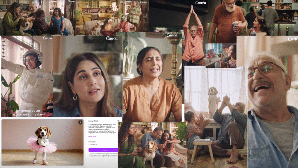
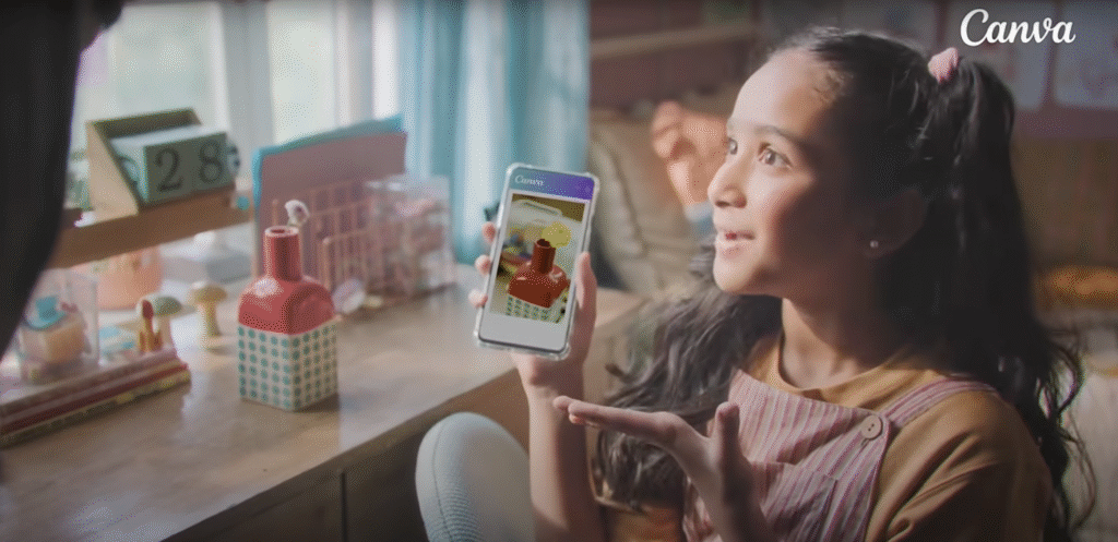
The campaign’s breadth reveals both ambition and dilution. Beyond the 2-minute ‘Jaadu Dadu’ emotional centrepiece, we encounter five shorter advertisements: ‘Design & Publish – Astronaut in the Making’, ‘Canva AI – Ballerina’, ‘Background Remover – Park-tically There’, ‘Magic Edit – Flower Power’, and ‘Canva AI – Spa Day’. Each clocks in under 30 seconds, designed for digital consumption and social media optimisation.
This proliferation of content serves modern marketing imperatives—creating touchpoints across multiple user journeys—yet reveals the campaign’s fundamental weakness: the subordination of creative depth to algorithmic demands.
Technical Competence Masquerading as Innovation
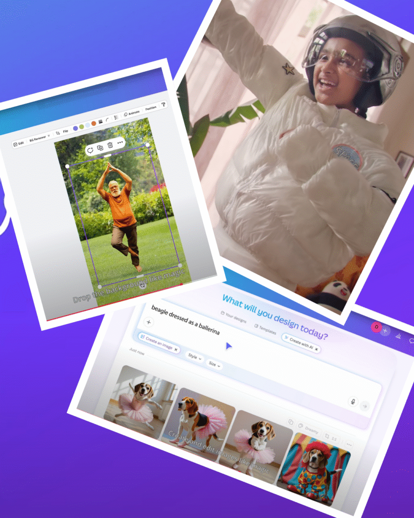
The shorter advertisements function primarily as product demonstrations wrapped in whimsical scenarios. ‘Astronaut in the Making’ shows a child designing space-themed content, ‘Ballerina’ demonstrates AI image generation, whilst ‘Park-tically There’ showcases background removal capabilities. Each follows the same formula: charming premise, seamless tool integration, implied effortlessness
This approach succeeds as functional communication but fails as memorable advertising. The technical execution is flawless—Canva’s tools genuinely appear intuitive and powerful—yet the creative territories explored feel predictably safe.
Where campaigns like Apple’s ‘Think Different’ or Nike’s ‘Just Do It’ challenged cultural assumptions, Canva’s work operates entirely within comfort zones.
The Emotional Manipulation Problem
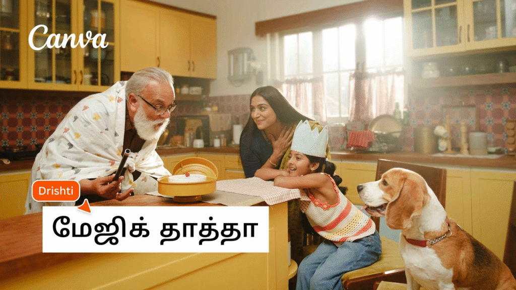
‘Jaadu Dadu’ remains the campaign’s strongest component, yet its emotional architecture relies heavily on manufactured sentiment. Dalip Tahil’s grandfather character exists primarily to facilitate a redemptive arc that positions Canva as relationship healer. This isn’t storytelling; it’s emotional engineering designed to trigger specific responses.
The workplace narrative in the second film follows similarly formulaic territory. Generational workplace dynamics have become Indian advertising’s equivalent of the overused British trope of bumbling fathers—shorthand for relatability that actually reveals creative poverty.
“The emotional beats feel slightly too orchestrated, lacking the messy authenticity that would elevate good advertising to great”
Language Politics and Cultural Tokenism
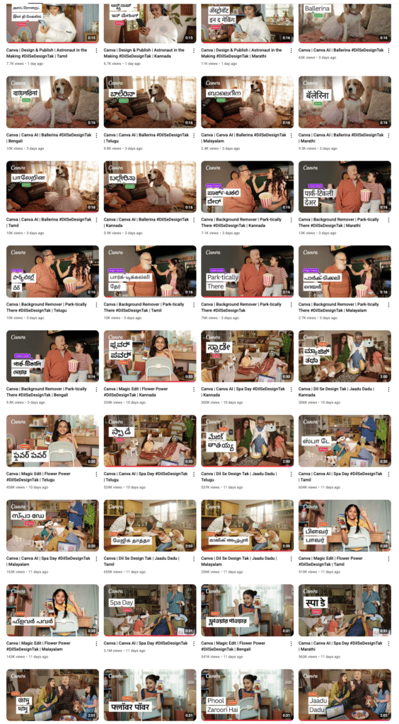
Canva’s multilingual approach deserves qualified praise. Producing hero films in Tamil and Telugu before dubbing into Malayalam, Kannada, Marathi, and Bengali demonstrates genuine respect for India’s linguistic diversity.
However, the execution occasionally feels like cultural box-ticking rather than authentic localisation.
The dialogue patterns, family dynamics, and conflict resolutions follow templates that work across cultures precisely because they avoid culturally specific nuances.
True localisation would embrace regional storytelling traditions, humour styles, and family hierarchies that differ meaningfully between Tamil Nadu and West Bengal.
The AI Integration Paradox
The campaign’s treatment of AI tools reveals a sophisticated marketing challenge poorly resolved. Canva must demonstrate advanced technological capabilities whilst maintaining accessibility messaging. The result is AI functionality that appears almost too magical to be credible.
‘Magic Edit – Flower Power’ shows Dadu effortlessly transforming images, yet real AI tools require iteration, refinement, and occasional failure.
By presenting seamless first-time success, the campaign may inadvertently intimidate users who expect similar effortlessness and become frustrated with actual tool limitations.
Production Values Versus Creative Courage

Working with OML Entertainment, Canva has achieved consistently high production standards. The cinematography, performance quality, and post-production work demonstrate professional excellence. Yet this polish occasionally works against the campaign’s accessibility messaging.
The visual sophistication signals premium positioning whilst the copy emphasises democratisation. This tension—between aspiration and accessibility—runs throughout without resolution. Premium production values suggest professional-grade tools, potentially alienating casual users despite messaging aimed at universal creativity.
Competitive Context: Playing It Safe in a Disrupted Market
Against India’s broader advertising landscape, ‘Dil Se Design Tak’ feels competently conventional rather than breakthrough. The emotional storytelling approach aligns with successful Indian campaigns from Cadbury, Asian Paints, and Airtel, yet lacks the cultural friction that makes advertising genuinely memorable.

Consider Zomato’s irreverent social media presence or Swiggy’s absurdist advertising—brands that embrace cultural tensions rather than smoothing them over. Canva’s approach prioritises broad appeal over pointed relevance, commercial safety over creative risk-taking.
The Scale Ambition Problem
Canva’s stated ambition to reach 200 million users creates inherent creative limitations.

Messaging designed for such vast audiences inevitably gravitates toward lowest-common-denominator appeal.
The emotional specificity that makes ‘Jaadu Dadu’ work becomes diluted when stretched across diverse user segments.
This represents a classic brand scaling dilemma—as reach expands, resonance often diminishes. Canva’s Indian campaign succeeds within these constraints whilst highlighting their creative costs.
Missing Opportunities: Where Real Innovation Lives

The campaign’s most significant failure lies not in what it does poorly, but in opportunities unexplored. Real creative innovation might have addressed:
- The Failure Question: What happens when design doesn’t work? When templates clash? When AI produces unexpected results? Acknowledging creative process messiness would demonstrate genuine understanding.
- The Democratisation Tension: Who gets left behind when design becomes ‘democratised’? Professional designers? Traditional artists? Addressing industry disruption honestly would show authentic leadership.
- The Cultural Specificity Challenge: How does visual communication differ across India’s regions? What design traditions get preserved or discarded? Deeper cultural exploration would demonstrate real localisation commitment.
Technical Achievement, Creative Timidity

Ultimately, ‘Dil Se Design Tak’ represents mature brand communication that prioritises execution over experimentation. The campaign achieves its stated objectives—demonstrating product capabilities, building emotional connection, establishing local relevance—whilst avoiding the creative risks that generate genuine cultural impact.
For a platform dedicated to empowering creative expression, the campaign feels paradoxically cautious. It succeeds as commercial communication whilst missing opportunities to model the creative courage it ostensibly champions.
The work functions beautifully as brand-building exercise and product demonstration. As advertising that challenges, surprises, or genuinely inspires—the very qualities Canva’s platform promises to enable—it feels disappointingly conventional. In an attention economy that rewards boldness, this measured approach may achieve commercial objectives whilst surrendering cultural influence.
For Canva India, ‘Dil Se Design Tak’ establishes solid foundations. Whether future campaigns will build genuine creative monuments or merely competent commercial structures remains the more interesting question.