Netflix hasn’t just shipped another recommendation tweak. It has quietly turned its search box into a chat with an algorithm: “Ask for vibes, themes, titles — whatever you’re craving!” You can type “slow‑burn enemies to lovers”, tap chips like “myths and legends”, or simply say how you feel and let OpenAI’s model do the work.macrumors+4
On paper, that sounds like the natural next step after years of carousels and “Because you watched…” rows. It matches how people actually talk about TV: “I want something cosy but not shallow, short episodes, no gore.” In practice, though, the beta has been called “annoying”, “inaccurate”, and “more work than before” by the viewers who tried it.reddit+3
This is the tension UX teams are about to live in: your product will be judged by an AI you don’t fully control, while stakeholders market it as magic. Netflix’s experiment is one of the clearest live case studies of that gap—and a good lens for updating how we design, write, and ship AI‑driven search.
“The UI of an AI feature can easily be too slick for the model behind it.”
If you work on streaming, search, or any product being told to “add AI”, this isn’t a neat case study to bookmark. It’s a decision point.
Why this matters right now
Every big consumer product is now pushing AI assistants into core navigation. Netflix has mood‑based search. Meanwhile, YouTube is experimenting with AI summarisation and conversational recommendations. Prime Video, for its part, is rolling out AI‑driven personalisation behind a more conventional interface.techcrunch+5
Broadly, leaders want three things:
- A differentiator that screenshots well in an earnings deck.
- Less friction for overwhelmed users paralysed by choice.
- A story that they’re doing something bold with AI, not just tuning thumbnails.
By contrast, UX people are dealing with different questions:
- How do we stop AI from breaking core flows when it is wrong 10–20% of the time?
- What’s the right mental model for people who just want to find a known title?
- How do we explain what the model is doing without writing a textbook in the UI?
In other words, Netflix is one of the first mainstream, non‑technical products to put generative AI front‑and‑centre in search. If it goes well, its pattern will be copied by everyone else. If it goes badly, it will become Exhibit A the next time you push back on an “AI everywhere” roadmap.
This is also happening in parallel with the broader AI marketing hype I’ve already written about, from OpenAI’s staged announcements to Google’s Stranger Things watch‑party integrations. Those pieces show how brands wrap complex AI capabilities in nostalgic stories or familiar metaphors. Netflix is trying something similar inside the product, which makes the UX trade‑offs impossible to ignore.suchetanabauri+1
What Netflix actually shipped
The core ingredients are straightforward:
- A new Search (BETA) view that sits on top of the existing search experience.about.netflix+1
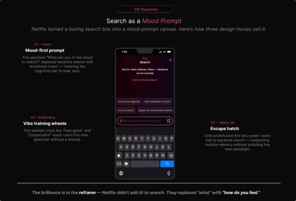
- Conversational microcopy: “Ask for vibes, themes, titles — whatever you’re craving!” and a prompt field that asks, “What are you in the mood to watch?”dig+2
- Prompt chips such as “myths and legends”, “from enemies to lovers”, “based on newsworthy events”, which hint at the types of prompts it expects.
- OpenAI‑powered generative models that turn those prompts into curated rows of titles.tomsguide+3
- A “Switch to Standard Search” link if you just want the old alphabetical, title‑driven behaviour.about.netflix+1
At the moment, the feature is in a limited, opt‑in beta on iOS in a handful of markets. Netflix explicitly describes this as an experiment they’ll refine based on feedback.techcrunch+3
All of that sounds reasonable. It becomes more interesting, however, once you look at how people are reacting.
“Netflix didn’t just add a new row; it tried to change how we ask for TV.”
What users are actually saying
On the surface, launch coverage frames the feature as something that “understands your mood” and “helps you find the perfect show faster”. Under that gloss, common complaints appear quickly.techweez+4
People say that:
- Basic search gets worse. Several posts describe having to type the entire show name before it appears, where previous search would find it after a couple of letters.reddit+2
- Mood prompts feel shallow. Queries like “scary but not too scary and a bit funny” often return either intense horror or bland, mainstream picks that only loosely fit the description.uniladtech+4
- Recommendations feel sales‑driven. Commentators note that the AI’s “personalisation” still heavily features Netflix originals and familiar hits, suggesting the ranking is tuned as much for promotion as for genuine fit.forbes+4
- Extra friction creeps in. Instead of a quick title lookup, users feel nudged into writing longer, fuzzier prompts that don’t consistently pay off—“more typing, more scrolling, same old results”.zdnet+3
Reddit and tech‑press comment sections are full of that sentiment: the feature is clever, but not quite trustworthy enough to replace the old way of searching.
How reviewers and testers see it
However, reviewers who approach it more methodically are gentler but still cautious. Mood search is “surprisingly good at broad requests”—“feel‑good comedies”, “tense crime dramas”—and often nails the high‑level genre‑plus‑tone pairing.tech-now+3
Once you combine constraints or ask for something personal and narrow, though, it falls down. Multi‑constraint prompts like “post‑breakup but hopeful, not bleak, under 90 minutes, preferably Indian” frequently produce generic or mismatched lists.mikeloveday+4
Crucially, no one is publishing hard accuracy numbers; everything is anecdotal and framed as “promising, but early”. That’s not a criticism—it’s how consumer launches work. It does, however, put more pressure on the UX to set expectations honestly.bloomberg+3
“The gap between ‘understands your mood’ and ‘gets the broad vibe right most of the time’ is where trust lives—or dies.”
The UI sells a promise—and hides the limits
At first glance, the search screen does three clever things:
- It reframes search as an emotion. “What are you in the mood to watch?” invites human language, not database thinking.
- It gives you training‑wheel prompts. Chips like “myths and legends” and “from enemies to lovers” hint at the acceptable shape of queries without saying “prompt”.
- It keeps a link to standard search within reach. “Switch to Standard Search” is a smart escape hatch.aikatana+2
Taken together, those choices make the UI strong from a purely visual and microcopy perspective. High contrast, minimal clutter, clear hierarchy—it feels like a natural continuation of Netflix’s cinematic, full‑screen treatments.forbes+1
Yet despite that polish, the problems start after the user hits return.
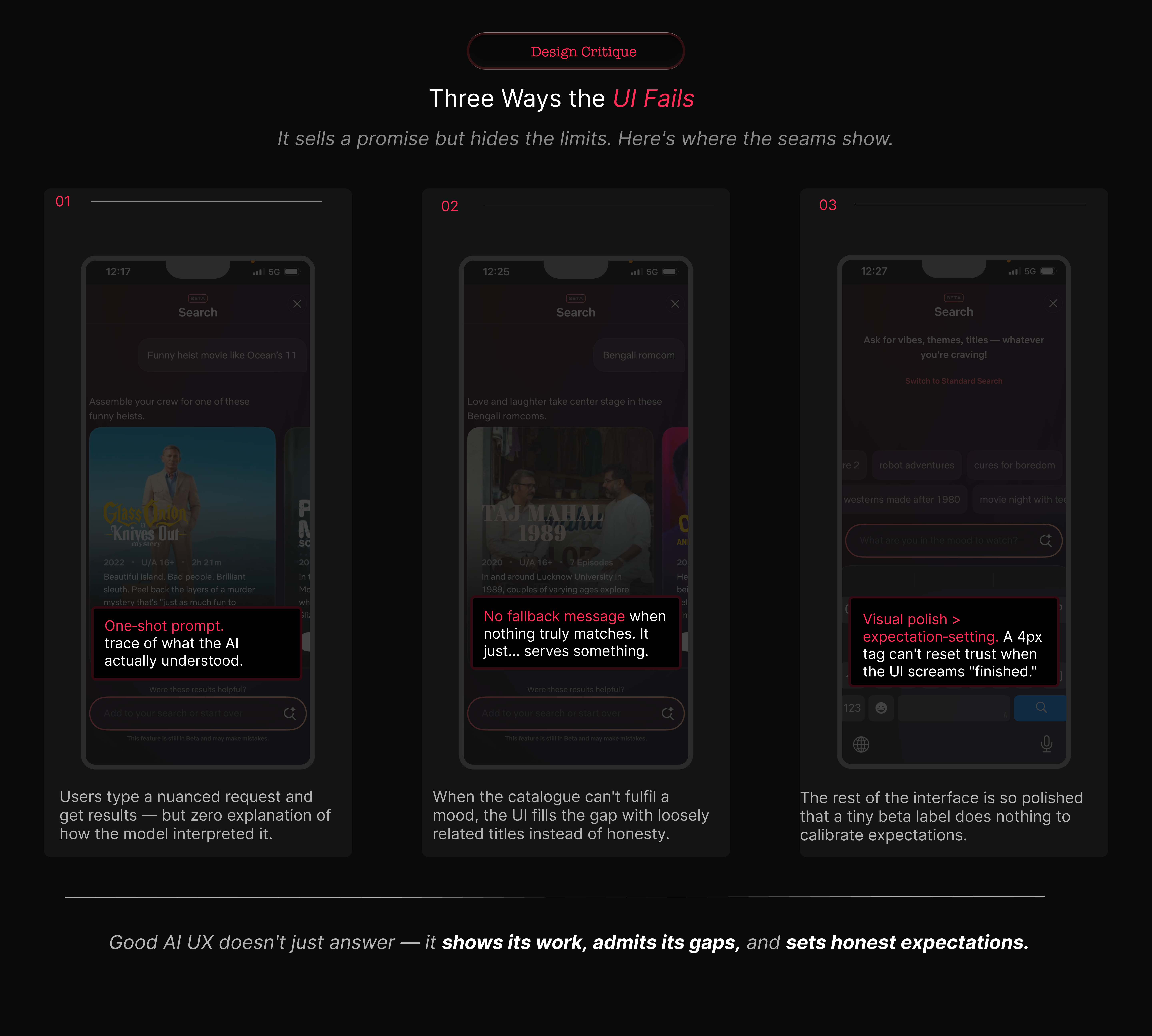
It hides how the AI interpreted you
The interaction is still one‑shot. You type a paragraph, Netflix turns it into tiles, and that’s that. There’s no visible intermediate step:
- no “Searching for: cosy, low‑stakes romance, short episodes, no gore”;
- no chips representing what it latched on to—“cozy”, “romance”, “short episodes”, “no horror”—that you can toggle off;
- no clear way to relax or tighten one constraint without rewriting the prompt.
YouTube is guilty of similar opacity in its recommendation feed. However, its AI tools are mostly sidecars; the core “type term → see videos” loop still behaves like a conventional search list.searchenginejournal+1[youtube]
If users can’t see what the model thought they asked for, they can’t learn how to ask better questions.
It refuses to say “no”
When the model doesn’t understand or the library lacks a close match, Netflix appears to fall back to generic rows rather than admitting it.reddit+3
We have seen a softer version of this before with “Because you watched…” rows that sometimes connect on one thin thread (same actor, same country) while ignoring the real reason you liked the original. Here, the stakes are higher, because the user has expressed a specific mood and constraint set.
There is a missed opportunity to say, explicitly:
- “We don’t have much that fits ‘light, short, non‑violent thriller’. Here are straight dramas instead.”
- “We ignored ‘set in India’ because there weren’t enough results; you can browse Indian titles here.”
My piece on Google’s Stranger Things watch‑party campaign talks about how they wrapped a complex capability in an 80s‑nostalgia story to make it feel approachable. Netflix is doing something similar, but here the story (“we understand your mood”) is front‑loaded and the hard truths are hidden.[suchetanabauri]
It overstates how “beta” it really is
There’s a small “BETA” badge at the top of the screen. That’s it.
Netflix’s help content and press briefings are more candid: they describe this as an experiment, limited to certain markets and devices, with plenty of iteration planned. Most people will never read those. They’ll take the UI at face value: polished, confident, ready.dig+3
As a rule, the more experimental your backend is, the plainer your frontend claims should be. Here, it is reversed.
“If your AI is genuinely ‘learning’, your microcopy should sound more humble than your press release, not less.”
Compared with YouTube and Prime Video
For context, it helps to see how YouTube and Prime Video are folding AI into their own surfaces.
YouTube: AI as a sidecar
For example, YouTube in 2026 still leads with:
- a conventional search bar;
- recommendation feeds that drive most watch time;
- filters and metadata‑heavy lists.
AI shows up as:
- conversational helpers under some videos;
- automatic chaptering and summarisation;
- experimental AI‑generated insights.blog+1youtube+1
If those AI elements fail, the core “type term → see videos” loop still works exactly as expected. For most viewers, AI feels like an enhancement layered on top of a familiar structure.
Prime Video: clarity over cleverness
Meanwhile, Prime Video’s big interface updates have focused on solving a more basic pain point: “What’s actually included in my plan?”
The redesign emphasises navigation tabs, clear labelling (“Included with Prime”, “Rent”, “Buy”), and straightforward lists. Recommendation improvements exist, but they’re mostly invisible—better ordering of rows, some “Top 10 in your country today”, a bit more personalisation.variety+2
Search remains classic: a title/actor field with suggestions and filters. You’re never asked to pour your feelings into the box.
Netflix: the risky middle
Against this backdrop, Netflix has taken a bolder route:
- turning search into a mood‑prompt canvas;
- tying that to a brand narrative about AI‑driven discovery;macrumors+3
- keeping old‑school search accessible, but visually secondary.
I’ve written previously that the most interesting campaigns are where product and story are tightly coupled. Netflix is a textbook example: AI search is both a UX experiment and a marketing story about “smarter discovery”.[suchetanabauri]
The downside is fragility. When mood search fails, the entire search experience feels broken, not just the AI layer. And because Netflix’s business incentives around promoting originals are so obvious, every slightly off recommendation reads as bias, not just error.
“YouTube and Prime are using AI to make old patterns work better. Netflix is trying to swap the pattern itself. That’s a much bigger UX gamble.”
Accuracy is an organisational choice, not just a model metric
We keep asking: “How accurate is Netflix’s mood search?” In practice, the evidence so far looks like this:
- It is fairly strong at broad genre‑plus‑tone prompts (“feel‑good comedy”, “dark mystery”) according to reviewers.voice.lapaas+3
- It struggles with multi‑constraint, personal prompts (“post‑breakup but hopeful, not bleak, under 90 minutes, preferably Indian”), often returning generic or mismatched lists.linkedin+4
- The final ranking appears heavily influenced by Netflix’s internal priorities—originals, new releases, high‑engagement titles.mikeloveday+3
Crucially, there is no public, standardised metric that compares recommendation accuracy across Netflix, Prime, YouTube and others. Instead, we rely on proxies:photoshopvideotutorial+3
- engagement and watch‑time;
- customer satisfaction scores (where Netflix now trails a few rivals);investors+2
- anecdotal user sentiment (“these recommendations actually know me”).
The important point for UX is this: accuracy is being defined inside each company, not by some neutral standard. If a leadership team decides that showing a new flagship original at the top of every list counts as “accurate enough”, that is not a model constraint. It is a business decision.
“The algorithm isn’t neutral; it’s a policy, written in code and loss functions.”
In my analyses of AI marketing strategy I have already made a similar argument: narrative choices frame tools as either benevolent helpers or inevitable futures. The same dynamic plays out here in interface form.jomswsge+1
Five design principles to steal (or invert) from Netflix
So what does this mean for teams designing AI‑adjacent experiences? Here are five deliberately opinionated principles.
1. Don’t turn your core utility into a mood board
First, remember that search is infrastructure. It’s plumbing. Once you stake it on generative AI, every hallucination becomes a leak.
Netflix’s choice to make mood search the hero brings differentiation, but also erosion of basic trust when it fails at simple title lookup.reddit+2
If you’re building something similar, keep generative AI as a layer until you have evidence it beats classic search for core tasks. Use explicit mode switches—“AI suggestions” vs “Standard search”—instead of silently changing behaviour behind the same icon.
This mirrors the lesson in my analysis of Google’s watch‑party experiment: wrap new behaviour around old affordances; do not rip them out.[suchetanabauri]
2. Make the AI’s understanding visible
Second, make the model’s interpretation visible. Right now, Netflix acts like a black box. A better pattern would:
- surface parsed elements (“cozy”, “romance”, “short episodes”, “no horror”) as chips you can edit;
- show how it weighted each dimension (“prioritising: short episodes, then mood, then genre”);
- let you nudge results without rewriting the whole prompt.
That sort of “exposed understanding” is exactly the kind of system layer you’ve been sketching in your own UX writing and systems work.
3. Design explicit failure states
Third, design for failure. The instinct to hide “no results” is strong. Netflix’s current approach—falling back to vaguely related titles—protects engagement at the cost of clarity.netflix+2
Instead, aim for:
- clear “we couldn’t find exactly that” messaging;
- honest explanation of what was dropped or relaxed;
- obvious routes back to filters or classic search.
Streaming UX research suggests that viewers are more forgiving of honest gaps than of opaque nudges.accedo+2
4. Separate marketing copy from product reality
Fourth, separate the story from the surface. “Understands your mood” is brilliant PR language. In‑product, copy should sound more like:techcrunch+2
- “Try describing mood, genre, or pace.”
- “Best for inspiration—use standard search for exact titles.”
Your analysis of OpenAI’s marketing strategy argues for this sort of honesty: when claims get too far ahead of capability, the backlash undercuts trust in the whole category. Netflix risks that here if the UI keeps over‑promising.ewadirect+1
5. Treat AI as a collaborator with constraints
Finally, treat AI as a collaborator, not an oracle. Netflix’s engineering blog on graph search makes it clear that generative AI is one layer on years of work in semantics and recommendations.[netflixtechblog]
For UX, that means:
- using AI to propose candidates, then applying deterministic rules around safety, suitability, and business logic;
- keeping those rules visible enough that users aren’t surprised by what shows up;
- giving designers and writers a say in where AI is allowed to operate and where it must defer to stricter systems.
What this means for UX professionals
Taken together, Netflix’s AI search is not just a streaming story. It is a template for how AI will be bolted onto everything from ecommerce to productivity apps.
“The real risk isn’t ‘AI will replace designers’. It’s designers becoming decorators for opaque systems they’re not allowed to question.”
To avoid that, three moves are worth making.
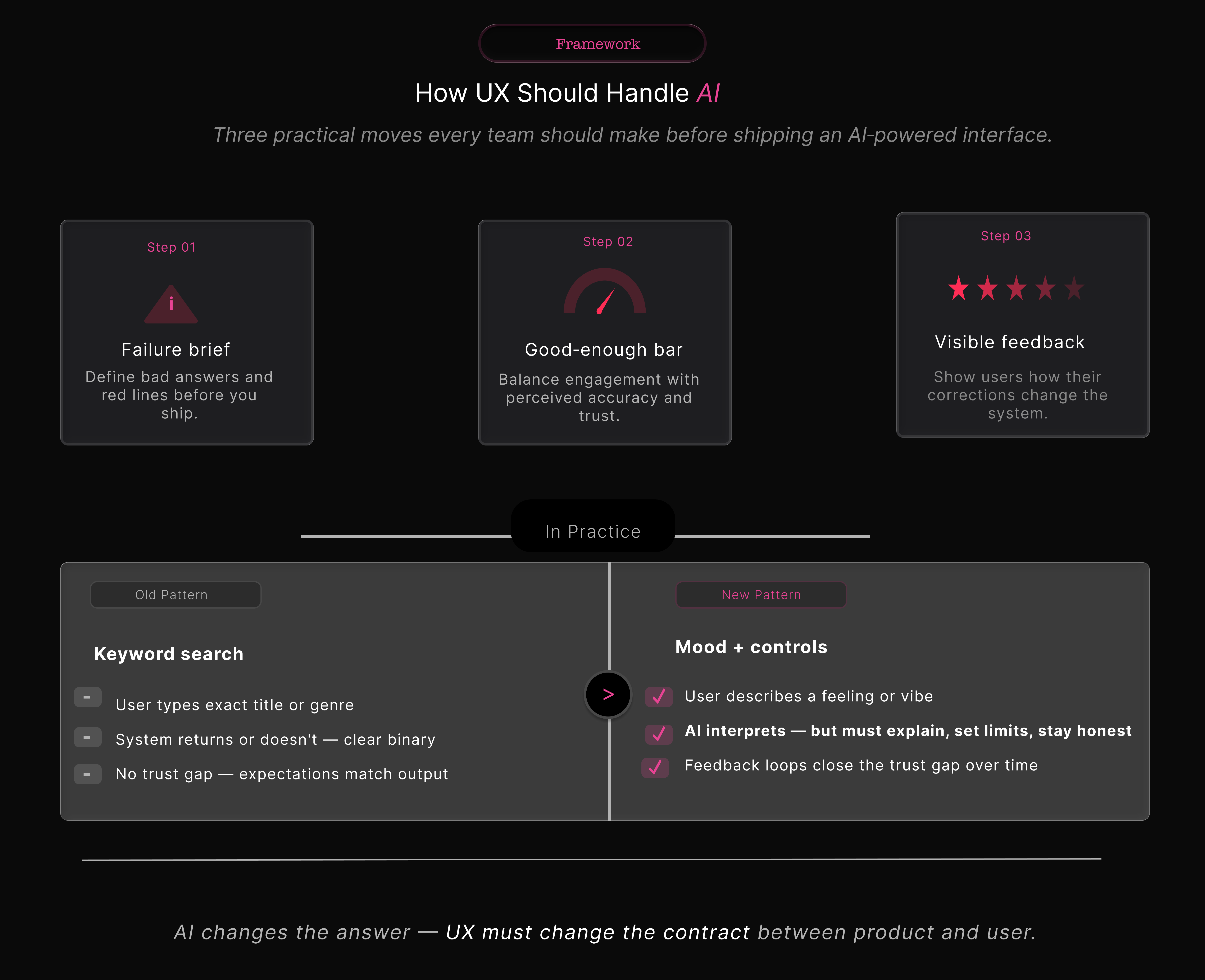
1. Start every AI project with a failure brief
Alongside the happy‑path brief, capture:
- what a bad AI response looks like;
- where “slightly off” becomes harmful, not just irritating;
- which failure modes you’re willing to ship with in v1.
In Netflix’s case, one red line could have been “does not reliably find known titles from partial input”. Instead, the emphasis appears to have been on discovery and marketing story, not baseline robustness.reddit+3
2. Own the definition of “good enough”
Next, own the definition of “good enough”. Product and data science will chase watch‑time and click‑through. UX needs its own metrics:
- perceived accuracy (“Did this feel right?”);
- effort to fix a bad result;
- trust over time (“Do you try AI search again?”).
You’ve already done similar work when breaking down AI product launches from a marketing‑effectiveness angle—showing how different KPIs tell different stories about the same campaign. The same discipline needs to show up in AI UX.jomswsge+1
3. Build feedback that users can see working
Finally, build feedback loops that are visible. Netflix says it will learn from feedback. The interface doesn’t yet make that tangible.digialps+2
Good patterns here are:
- local controls (“Show me less like this”, “Hide this mood”);
- visible confirmations (“We’ll prioritise lighter comedies next time”);
- reversible settings for multi‑profile households.
This is also where you can cross‑link to your existing writing on feedback loops in AI tools and how marketers should think about “teaching” their models without overwhelming users.[suchetanabauri]
So, who actually has the “best” AI recommendations?
The short answer is that no one can prove it.
Analysts tend to agree that Netflix, Amazon Prime Video, and YouTube run some of the strongest recommendation engines in streaming. Recent satisfaction surveys, however, put services like Peacock, Paramount+ and YouTube Premium slightly ahead of Netflix in overall customer satisfaction.tech.yahoo+6
That tells us something important: sophisticated AI is not the same as the best perceived experience. Trust, clarity, and control weigh just as heavily as raw model quality.
“The UX win isn’t having the cleverest model. It’s putting that model somewhere it helps more than it hurts.”
Right now, YouTube and Prime Video are playing it safe, using AI to reinforce familiar patterns. Netflix is out on a limb, trying to rewrite the pattern itself. That limb could become the new trunk of streaming UX—or it could snap.
For your readers—marketers, product folks, and UX writers—the takeaway is simple: the most interesting AI stories are no longer just in ad campaigns or launch videos. They’re in the quiet, fragile places where we ask users to trust an algorithm with their time, their attention, and, increasingly, their mood.
Here’s a compact footnote list you can paste under the article. You can renumber them to match your in‑text references.
Footnotes
Netflix launch & docs
- Unveiling Our Innovative New TV Experience Featuring Enhanced Design, Responsive Recommendations and a New Way to Search – Netflix newsroom.
- A new way to search on Netflix – Netflix Help Centre.
OpenAI‑powered mood search
- Netflix’s New AI Search Feature Will Understand Your Viewing Moods – MacRumors.
- Netflix debuts its generative AI‑powered search tool – TechCrunch.
- Netflix Tests New AI Search Engine to Recommend Shows, Movies – Bloomberg.
- Netflix Tests OpenAI Powered Search for Moods and Natural Language – LinkedIn article by Anshu Jha.
Early accuracy tests & explainers
- Netflix’s AI‑Powered Search: A Game‑Changer for Personalised Streaming – Tech‑Now.
- Netflix and OpenAI: Improving Search with Mood‑Based Recommendations – Mike Loveday.
- Netflix Is Testing an AI Feature That Recommends Shows Based on Your Mood – TechWeez.
- Netflix tests out new AI search engine for movies and TV shows – Mashable.
User complaints & scepticism
- I hate the ai search – r/netflix.
- Why is searching on Netflix so awful? – r/netflix.
- Netflix’ search engine is absolutely awful… – r/netflix.
- Why doesn’t Netflix have an ai to know your tastes and propose accordingly? – r/RandomThoughts.
- Netflix users slam ‘annoying’ AI update as streaming service gets a new feature – UNILAD Tech.
Interface revamp & TikTok‑style feed
- Netflix’s Big Interface Revamp Gives More Info, Better Search, a Dash of TikTok – Forbes.
- Netflix’s new AI search feature makes it easier to find what to watch – ZDNET.
- Netflix to revamp TV app interface, launch AI‑powered search for iOS users – Reuters.
YouTube and Prime Video patterns
- Two new ways YouTube is using AI to bring you more of what you love – YouTube Blog.
- How YouTube’s Recommendation System Works in 2025 – Search Engine Journal.
- Amazon’s Prime Video Interface Update Promises to Make It Easier to Tell What’s Included With Your Subscription — and What Costs Extra – Variety.
- Prime Video Redesigns Interface with New Navigation, Top 10 Features – CNET.
- Prime Video rolls out an improved streaming experience – Amazon.
Recommendation quality & satisfaction
- Top AI Recommendation Systems for Streaming in 2025 – Photoshop Video Tutorial blog.
- Video Streaming Service – Entertainment Study 2025 – American Customer Satisfaction Index.
Technical background on recommendation engines
- The AI Evolution of Graph Search at Netflix – Netflix TechBlog.
- Netflix, Amazon Prime, and YouTube: Comparative Study of Streaming Infrastructure and Strategy – Journal of Information Processing Systems.
Related work on suchetanabauri.com
- Why Google Wants to Be Your Watch Party Host – Suchetana Bauri.
- technical marketing analysis – archive on suchetanabauri.com.