Much like the colorful chaos of a design brainstorm—where Why?, How?, and When? float like confetti—Indian brands are rewriting their visual language with the urgency of a pitch deck on a deadline.
A curious thing is happening in the world of Indian branding. You may have noticed that your favorite homegrown brands—once wrapped in layers of colors, curls, and cultural cues—are suddenly all grown up and dressed like they’ve just come out of a San Francisco design sprint.
The change is not just about aesthetics—it’s strategy. Think less about ‘beautifying’ and more about ‘positioning’. As Indian companies raise big bucks, reach new markets, and court Gen-Z eyeballs, their branding is shifting towards sleek minimalism, sans-serif fonts, and UI-friendly color palettes. Welcome to the age of Indian brands that look, feel, and scroll like global tech startups.
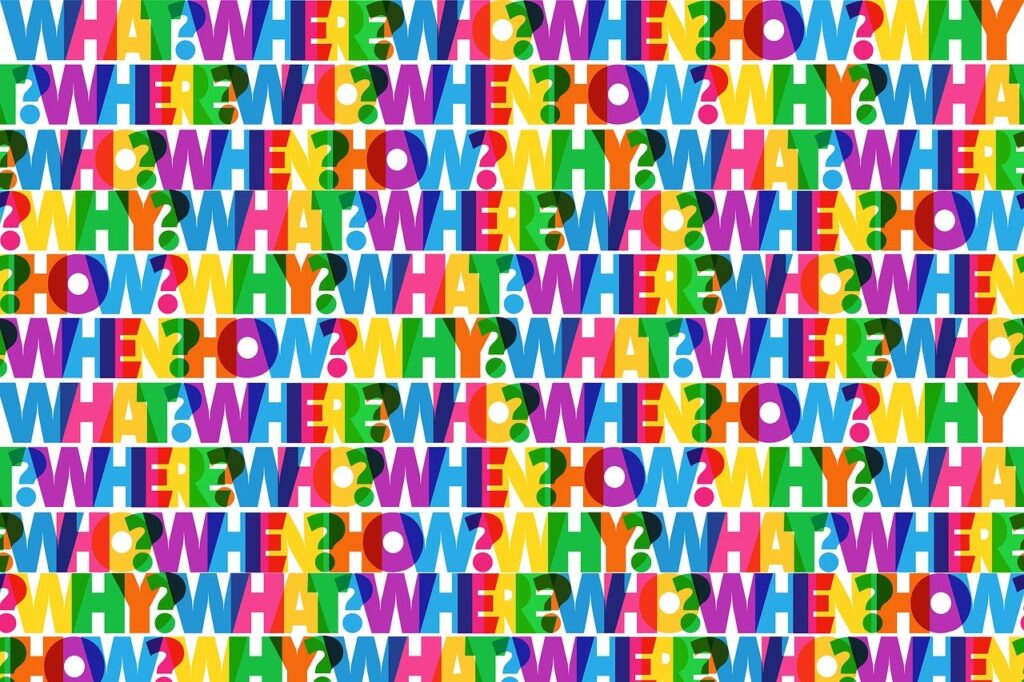
From “Why not?” to “Why this font?”—Indian brands are asking the right questions in their design glow-up.
A New Visual Vocabulary
Gone are the busy logos with heritage fonts and saffron-yellow backgrounds. Today’s Indian brands are all about clean lines, cool tones, and restrained typography. According to branding research, minimalist logos can boost visibility by up to 20%. That’s right—less really is more, especially when it comes to pixels and perception.
Take Native Milk. Their rebrand involved a simplified cow logo, featuring a glass of milk cleverly hidden in the design. It’s cute, clean, and Instagram-ready. The kind of logo that says, “We’re traditional, but we do know what kerning means.”
Typography has also taken a turn—from practical to playful. Think kinetic type, asymmetrical layouts, and creative use of regional scripts. You’re as likely to see Hindi written in deconstructed minimalism as you are in calligraphy.
UI Meets Branding
Indian digital platforms—especially in fintech, edtech, and news—are adopting tech startup aesthetics. Dark mode? Check. Gradients? Check. Neon highlights on deep blacks? Of course. It’s like every Indian app decided to go to a rave and stayed for the afterparty.
Motion graphics and micro-animations are also replacing static logos and visuals. It’s all about catching (and keeping) the user’s attention—one bounce, flicker, or loop at a time.
What’s Fueling This Shift?
1. The Rise of Gen-Z and New Consumer Habits
By 2031, India’s consumer market is expected to double to $2.9 trillion (source). This isn’t just about quantity. It’s about character. Today’s buyers are more digital-native, globally aware, and design-conscious. If your brand still looks like it was built in Paint, they’re swiping left.
As Ashish Mishra, CEO of Interbrand India, says: “Most brands were in a hurry to reinvent themselves to be relevant to the new generation” (source).
2. Global Ambitions
Indian companies are thinking beyond borders—and branding is their passport. Design that looks globally familiar feels trustworthy, especially when pitching to investors or launching in international markets. With leaders like Sundar Pichai and Satya Nadella redefining what ‘Indian tech’ means globally, the homeland brands are following suit (source).
3. The Startup Ecosystem is Glowing Up
Over 100 Indian GenAI startups have raised $1.5 billion since 2020 (source). With money in the bank and eyes on scale, branding gets bumped up on the priority list. It’s not about whether you need a visual refresh—it’s about whether you want to be taken seriously in the pitch deck.
Case Studies: The Makeovers That Mattered
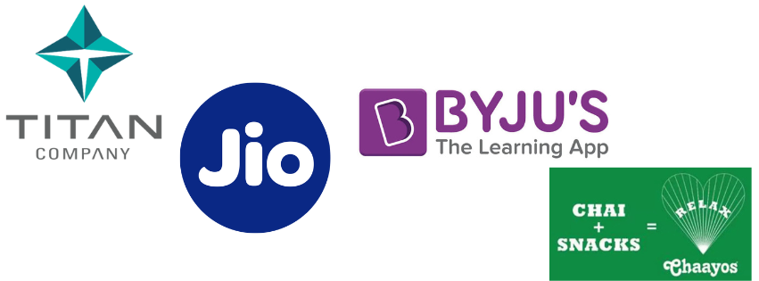
Titan
The brand that once defined traditional Indian watches is now turning heads in fashion and accessories. Their new visual identity is elegant yet edgy—heritage with a Gen-Z twist. The result? Elevated positioning and stronger resonance with a younger demographic (source).
Jio
Reliance Jio has rebranded to match its 5G ambitions. The new look is polished, tech-forward, and screams ‘next-gen connectivity’. Their earlier approachable vibe has been replaced with one that says: “We’re not just a telecom company—we’re the future” (source).
BYJU’S
BYJU’S went from cluttered and kid-like to playful-yet-polished. Their new branding bridges the gap between fun learning and serious edtech player—something both parents and investors appreciate (source).
Chaayos
This tea chain embraced a “contemporary desi” aesthetic. Think Hinglish packaging, Devanagari fonts, and illustrations that feel handcrafted but hip. The result? A 2.5x revenue increase and 50% higher in-store sales (source).
Do These Visual Shifts Actually Work?
Yes. And not just in theory. A study found that consumers trust Indian startups more when they visually look like they know what they’re doing—even if they’re still figuring it out behind the scenes (source).
For Chaayos, the rebrand directly translated to business results. Customers weren’t just looking at pretty cups—they were buying more of them.
It’s Not About Copying Silicon Valley
It may ‘apparently seem’ this trend is just about copying global tech aesthetics. But that’s only half the story. What’s really happening is a fusion—where cultural authenticity meets design modernity.
Brands are still rooted in Indian identity. They’re just expressing it in a way that aligns with how modern Indians (and global audiences) consume design.
This emerging language—sometimes dubbed “contemporary desi”—combines local motifs, regional languages, and traditional textures with clean visuals and international sensibilities. It’s masala minimalism, and it’s here to stay.
The Road Ahead: What Comes Next?
AI-Generated Design
With GenAI tools now capable of generating visual assets, Indian brands are exploring faster, cheaper, and more experimental branding workflows. Think automated logos, motion-based identity kits, and hyper-personalized visuals (source).
Immersive Experiences
AR, VR, and the metaverse aren’t just buzzwords anymore. Indian brands—especially in fashion, gaming, and e-commerce—are beginning to explore 3D branding and immersive UI experiences.
Purpose-Driven Aesthetics
As environmental concerns grow, more brands are baking sustainability into their brand narrative. Think recycled packaging, carbon-neutral design studios, and visual cues that convey ‘green’ values (source).
Final Thoughts: From Scroll to Soul
Indian branding is going through its biggest glow-up yet. What began as a flirtation with modern design has evolved into a full-blown transformation—rooted in strategy, backed by research, and powered by ambition.
Whether it’s a dairy brand looking like a wellness app or a tea startup channeling Glossier vibes, the shift is real—and it’s working.
Because at the end of the day, a brand isn’t just what it looks like. It’s what it signals. And right now, Indian brands are signaling confidence, global readiness, and a design sensibility that’s no longer an afterthought.
As long as they don’t forget their turmeric-stained roots while chasing their Helvetica dreams, we say: keep glowing.
Research and data sourced from: Inc42, Creative Gaga, Brand Equity, Social Samosa, Designer People, Cpluz, and others.